Enable javascript in your browser for better experience. Need to know to enable it? Go here.
Blogs Banner

Pro Sketch Techniques for Shared Libraries

How to raise the quality of your libraries to a professional level

As your product grows and matures, your design team will be faced with new challenges. New people need to design new screens using new components. Conventions become rules. Novices become experts. And your team’s Sketch skills have to keep up. In this article, we’ll explore a few techniques that will help you raise the quality of your Sketch files to a professional level.

When you collaborate with several designers, especially when creating a shared library, some extra effort is needed to ensure that
  • Symbols are fast and easy to use
  • Shared styles remain manageable
  • Common pitfalls are avoided
The following is a list of techniques I've collected over the years working with shared Sketch libraries.

Keep Symbols Manageable

1. Each shape layer should have a shared style

Manage the color of central shape layers using shared styles. That is, every shape layer (rectangles, combined shapes, vector shapes, …) should be attached to a shared style that should determine its color and other styles. If you need to change the appearance of such layers, change one of them and then update its shared style. This style will then be applied to all layers that share that style. Layers of symbols that use such shared styles can be easily overridden in symbol instances.

Generally, don’t use the global or document colors in the color picker as those are not overridable and can’t be changed centrally after the fact. The latter is also true for the new Tint feature, which is why I stick to the method explained above.

The shared layer menu
Fig. 1 The shared layer menu
 
Overriding a layer’s color with a shared fill style 
Fig. 2 Overriding a layer’s color with a shared fill style
Another useful trick is to have a transparent shared layer fill style. This makes it possible to hide layers in a symbol instance.


2. Each text layer should have a shared style

Text layers similar to shape layers should use shared styles.

A word on coloring text: I recommend to not manage text color through shared text styles as this leads to a multiplication of shared styles (one for each style in each color, e. g. H1 red, H1 black, H2 red, H2 black, …). Instead, use a boolean operation to color your text layers. That way, the color of text can be overridden in the symbol’s instances. Here is how to do that:
  1. Create a rectangle shape
  2. Intersect it with your text layer
  3. Give the resulting Combined Shape a shared layer style and you will be able to override the text color in the symbol’s instances.
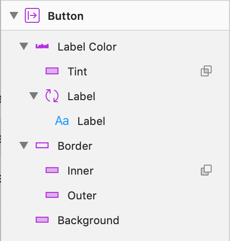
Sadly, this method removes the ability to override the text style as well. If you really need to be able to override both text color and style in a symbol’s instance, you’ll need to create another symbol that contains only the text layer (with a shared text style, auto-width, Artboard sized to fit, layout horizontal left to right), and intersect that with a tint layer. The resulting Combined Shape gets a shared layer style for color, and voila, you can override both color and text style in the symbol’s instance (see fig. 3).

A button symbol in which every layer can be overridden
Fig. 3 A button symbol in which every layer can be overridden

Make symbols easy and fast to use

3. Name your layers

A proper layer name will help your fellow designer understand the structure and meaning of your file much better. In libraries this is especially important because the names you give to your layers will be displayed in the override menu of your symbols. E. g., the name Rectangle is meaningless here, whereas Background tells your designer-friends that this is the place to override the style of a background layer.

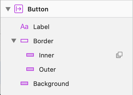
This symbol will be hard to use for your fellow designers
Fig. 4 This symbol will be hard to use for your fellow designers – the layers aren’t named properly and nothing but the label can be overridden, making this symbol rather inflexible.
 
figure 5
Fig. 5 This symbol has properly named layers and will be easy to use.


4. Set up widget states right way
Let’s say you want to create a text input symbol in variants like empty, focussed, error, and so on. Do not create several symbols for label, border, text, error message, etc., that you would combine to different variants. This is a lot of work and comes with the risk of making small positioning and sizing mistakes. Also, if you want to change something about size or positioning, you’ll likely have to touch a lot of symbols. I call this the Free-hand approach.

The free-hand approach – don’t do this
Fig. 6 The free-hand approach – don’t do this

Instead, create a base symbol for text input with overrides that can take on the style of any of the desired variants. That is, you’d make the border color overridable, the text color, background color, etc. Use this master symbol as the only layer in your variants and override its variants in the desired way. Then manage the overrides such that only the necessary fields can be overridden to make the symbol easy to use. I call this the Master symbol approach (see fig. 7).

The Master-symbol approach – do this
Fig. 7 The Master-symbol approach – do this
 

5. Be deliberate about managing overrides

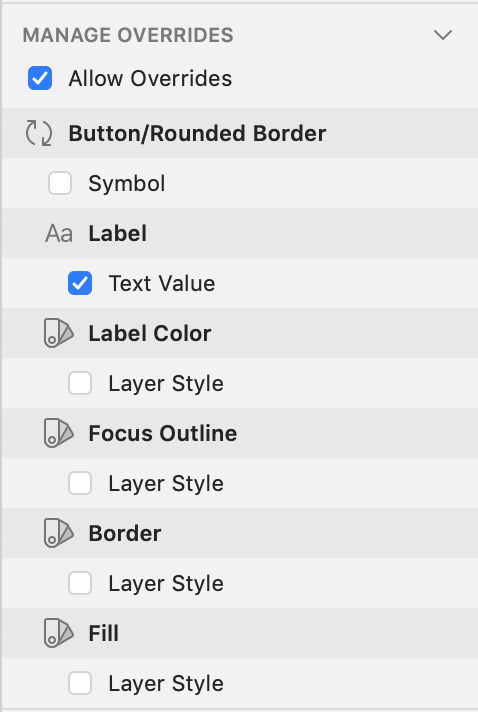
When you select the artboard of a symbol, the inspector will show the “Manage overrides”-panel. Here you can turn overrides on and off. Turn off everything that is unlikely to be overridden on a regular basis. For instance, this button symbol only allows the text of the label to be overridden.

The Manage Overrides
Fig. 8 The Manage Overrides panel. This button symbol is super easy to use because it only allows the text label to be overridden.

This makes the symbol dead-easy to use, at the cost of flexibility. Should a designer need to override some other property of the button, they can always detach the symbol. If you adhere to the principle above (Set up widget states the right way), this will give them the master symbol where they can override every property.


6. Order layers from top left to bottom right

The order of fields in the overrides panel is determined by the order of the respective layers in the master symbol. To make it easy to use, the layers should be arranged in a logical way. Plugins like Sketch Automate can help with that.

Sketch Automate
Fig. 9 Sketch Automate can help with ordering layers.

Avoid common pitfalls

7. Don’t use borders

In their default settings, borders are played on sub-pixel positions. That leads to several problems:
 
a. Blurry lines when exporting
b. Resizing problems
c. Measuring problems
d. Multiplication of shared styles
 
Show Pixels on Zoom
Fig. 10 What looks sharp in Sketch isn’t always sharp when you export it. Test exports using ⌃+P (“Show Pixels on Zoom”). In the default settings, borders become blurry.
 
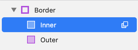
Instead, subtract a smaller rectangle from a larger one, pin it to the edges, and use a shared fill style on the combined shape to create a border with none of these problems.

subtracting one rectangle from another
Fig. 11 A better (and easily overridable) border can be created by subtracting one rectangle from another.

These shapes support rounded corners as well; just give the inner layer a smaller corner radius than the outer one.


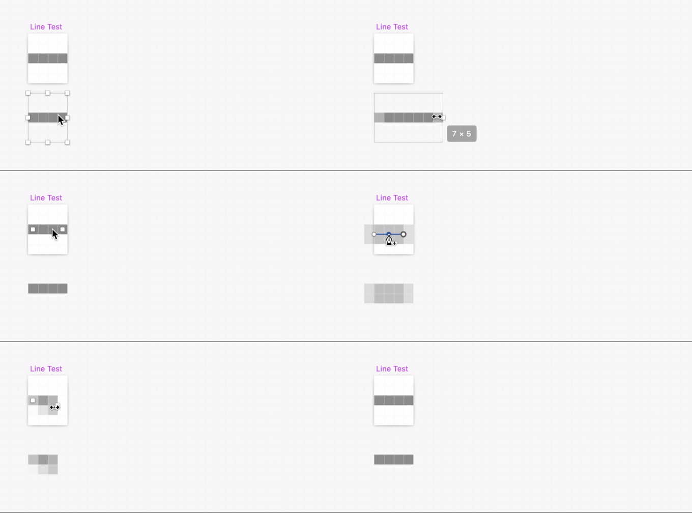
8. Don’t use lines

For similar reasons, rectangles should be preferred over lines, except of course if you need Bezier curves or for lines that are not perfectly horizontal or vertical.
 
Lines don’t resize well and are sometimes unwieldy
Fig. 12 Lines don’t resize well and are sometimes unwieldy.
 
If you don’t use lines and borders, you only have to manage shared fill styles for coloring your symbols.


9. Don’t use artboard background colors in symbols

If you want to give a symbol a background color, you should consider adding a background rectangle with a shared layer style. That way, the background color of the symbol instance can be overridden and is centrally managed. Artboard background colors do neither of these things.


10. Do use default margins for certain symbols

In your actual product, many components will have a default margin around them. For instance, there might always be a 16px margin beneath each input field. Your Sketch library should reflect that. To do this, simply make your symbol artboards a bit bigger. This makes it super easy to slap a few of them together without having to look up or even guess the correct distance between each.

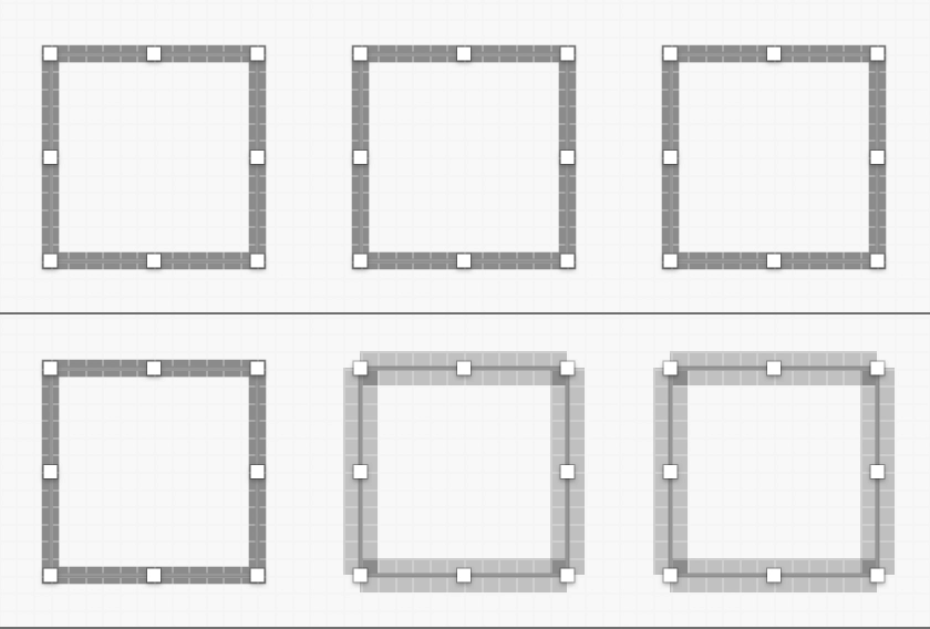
Figure 13
Fig. 13 The symbol on the right is easier to use because the symbol instances can snap to each other while still maintaining a proper spacing.
 

11. Set up icons the right way

All icon-symbols should have the same size. This allows you to swap every icon for another and therefore gives you flexibility that is essential for a modular library.

Secondly, all icons should be created as a Combined Shape with a shared layer style so their color can be changed to whatever is needed at that instance. Creating several symbols for the same icon in different colors is not scalable. Tip: name this layer “Icon Color” so that the override menu will be obvious to everyone.

Figure 14
Fig. 14 Any shape can be created with primitive forms and binary operations. Try creating your icons that way. Note that you can pin shapes to edges within combined shapes as well.
 
Figure 15 
Fig. 15 This is what an override panel for the above icon would look like

Note how you can combine different boolean operations like Subtract and Union on layers within the same Combined Shape. Using these, in combination with the resizing settings, allows you to create any icon shape you like, while maintaining resizability.

Lastly, all icon symbols should be made exportable so developers can easily download them as assets in Zeplin or Abstract.


12. Don’t use bitmaps

Bitmap images in symbols can get skewed when resizing a symbol instance, so don’t use them. Instead of dropping or pasting a bitmap image directly onto the canvas, create a rectangle and paste an image as a fill style. The fill styles can be set to Image, which itself can be set to Fill. Such images resize as you would expect and don’t get skewed.

The only downside of this method is that it doesn’t support images with a high pixel density.

Figure 16
Fig. 16 Nobody likes skewed images
 
Figure 17 
Fig. 17 Using the image fill style avoids skewed images

Note that you can select the pictures in the inspector and cut, copy, and paste them as well.

Figure 18
Fig. 18 This is how you set the fill style to an image

Team collaboration

The methods covered so far concern individual Sketch files. But for larger projects, you will have to handle chunks of work, scattered over a period of time, for a constantly evolving product. How to effectively do this is another blog post, but here are a few fundamentals that you should consider when collaborating on a shared library:
  • Use a version management system like Abstract.
  • Commit often.
  • Find a project structure that works for your team. A basic structure should encapsulate the shared library in its own project. This enables you to develop your library independently of any feature development.

Phew!

We’ve looked at a lot of methods and little tricks to improve the quality of a shared Sketch library. Not all of them may be applicable for your project. The key is to find the right balance of usefulness, usability, and correctness. A library that is good enough is worth more than a perfect but delayed one. A tool like Sleuth might help you figure out which components to tackle first.

When applying these methods, you will find that they will come naturally to you after a while, to the point where you also apply them in one-off designs without any significant time loss.

Disclaimer: The statements and opinions expressed in this article are those of the author(s) and do not necessarily reflect the positions of Thoughtworks.

Keep up to date with our latest insights