The 22 Rules of UX
Pixar’s 22 rules of storytelling adapted for UX — because both are about creating great experiences.
In 2011 Emma Coats, a former storyboard artist at Pixar, tweeted the “22 rules of storytelling”. The post has become well known and was recently re-done as image macros. As I was reading each of the 22 rules, I felt drawn to the message Emma was trying to convey. Stories create experiences — great stories make for great experiences. Put heart into your stories and consider your audience.
In the field of UX it’s similar but different. We’re trying to understand our users’ stories; we then craft a new one for them that (ideally) makes them happier and makes their lives easier. As I thought about this I saw that the 22 rules Emma had come up with could almost be applicable to the field of UX.
So I made some minor changes to see if I could adapt them.
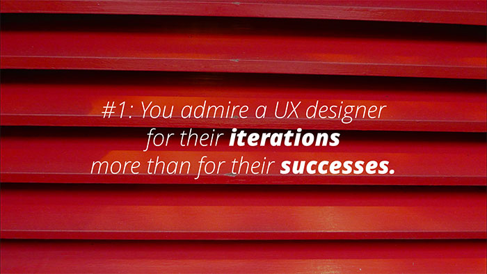
Successful UX is about making assumptions and then testing to validate. We do this through user research, user stories and prototyping. The key is to define assumptions, test, refine, repeat. This typically yields better outcomes than spending six months working on a ‘ta-da!’ piece. After all, your UX process is what smart employers will be looking for, as noted in this article by Whitney Hess.
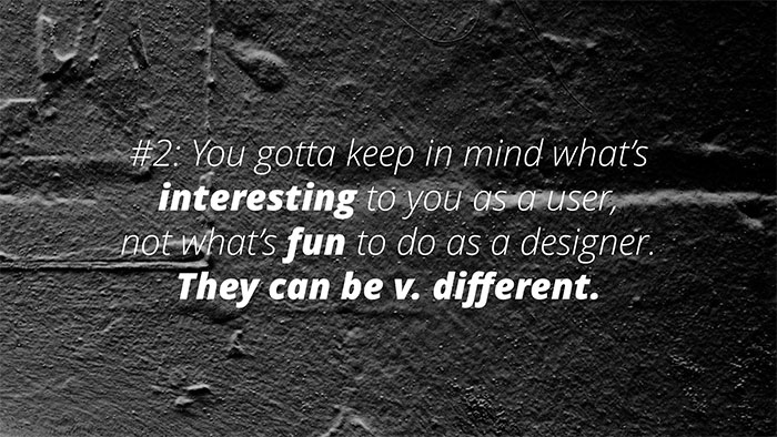
This is basic but something we are all tempted to forget. It can be exciting when you’re in Photoshop fueled by the latest new interfaces you’ve seen by designing the most beautiful and exciting feature set ever created. But we know this isn't always what excites our users or makes them happy. Keep your users in focus before you start designing — otherwise you’ll get carried away and fall into the trap of being attached to something you've invested too much time in.
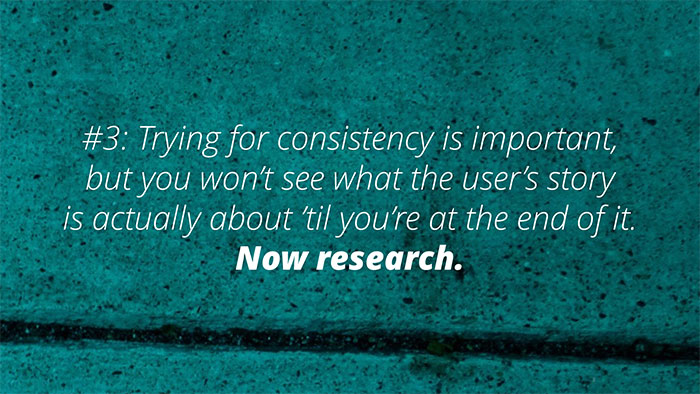
It’s easy to fall into the trap of wanting to create a sense of consistency within a product — it’s something we cling to, a basic principle that we feel will make things ‘easy’. I see this a lot — many people new to experience design focus on this idea of ‘consistency’ as it sounds safe and makes them feel comfortable.
In reality, consistency only works at a specific level and doesn't work on the level of interaction design or product design. There are existing design patterns that are helpful to start from as they generally play to users’ expectations of how things will behave. However arbitrarily going for ‘consistency’ without consideration for it’s impact on usability or experience is dangerous — especially if you don’t validate with testing.
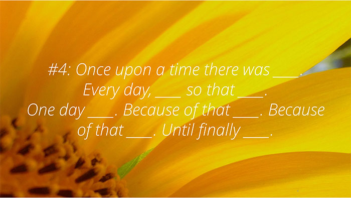
Tell the story of your user. People can relate to stories — they’re a powerful way to convey the feeling of the experience, empathy and understanding of someone else’s perspective and context. This is important when you can’t involve everyone in research sessions. You need to be able to bring the team on the journey in other ways, and stories can be one of those ways.
Stories can help define the baseline state, a user’s day to day life and work. Define the events and edge cases that would make a user behave differently. Explain the reasons for particular behaviour or choices. The ending is about how you craft an experience that improves on their existing one.
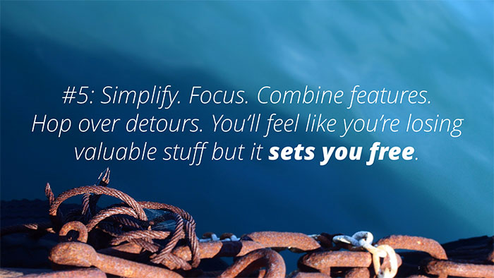
This was a key lesson for me as I journeyed through different projects. Features seem really important when you come up with them, making you feel like you need to account for absolutely every angle. The experience starts to get muddy and complex — but what do you get rid of?
It actually takes a lot of courage and focus to strip away the unnecessary to simplify experiences . It can feel like you’re missing something. The truth is users don’t necessarily need bells and whistles, so long as they can do what they need to smoothly and seamlessly, they’ll usually be happy.
This is clearest in the example of the iPhone. A long, long time ago I worked as a phone salesperson. My team and I would often agonize over the fact that while the iPhone seemed to lag behind in both specs and features -- customers would still pour in to buy it. Why? Because it does everything they need it to, simply.
Getting comfortable and assuming for the best is the worst thing you can do with a design or interaction. Interactions don’t always go smoothly — in fact a lot of the time your planned interaction falls apart under the ‘killing field’ of usability testing.
The kindest thing you can do for your design is to find the lowest common denominator and test the interaction there. Similarly, designs don’t always hold up in the ways they need to. Consider how your design needs to hold up on different devices or screen resolutions. What would happen if someone with vision impairment needed to increase the font size? Accessibility is also an important consideration here.
Your product needs to deliver a particular value proposition, experience and business benefit. And these need to be defined before you start designing. The questions of ‘how do we deliver this benefit?’ or ‘what value proposition will engage users?’ or ‘what does the experience look like?’ are fundamental and need to be explored first since the answers will have a huge impact on the design. If your design isn’t based on the answers to those questions, it’s very likely that it may not succeed in delivering business benefit or enticing users to use it — no matter how beautiful or usable.
The question here is ‘how fast can you go’? In Lean and Lean UX practices the term used to describe the minimum needed to learn and move forward is known as the ‘Minimum Viable Product (MVP)’.
This doesn’t mean creating a prototype that is so flimsy that it can’t be used as a test. It means considering what excess can you strip away from your prototype/test cycles.
Stay away from Photoshop and Axure in the beginning — these will slow you down. It’s not about deliverables anymore it’s about being lean and communicating within your team all the while avoiding ‘perfection’.
What isn’t right? What’s the experience you wouldn’t want your users to have — or what wouldn’t they do? Sometimes if you go through this process the answers will emerge in the negative space.
Really this is about stealing like an artist. No design or experience happens in a vacuum. What we enjoy is a product of our culture, what we experience and what is around us.
Whenever you respond to a design the things you feel are ‘cool’ or ‘trendy’ stem from things you’ve been previously exposed to. If you dig into these feelings you’ll identify design patterns and trends that are actually frameworks you can use to branch out from to create new designs.
This means you need to explore. Find designs and experiences that inspire you. Look at some of the best new content on sites like behance. This starts to create a library in your heart and mind that you can draw on to inspire you when you need to start crafting something.
I didn’t have to change the words for this one — it translates perfectly. It’s just so applicable across multiple disciplines. Have you ever had an idea you thought was so great, you spent a lot of your time trying to stand up your idea or defend it? Hopefully this happens to other people and not just me. It’s a bad habit. You tighten around your idea and become closed off to other peoples’ ideas.
You also don’t see the flaws in your idea or ever explore it deeply. Getting things on paper -- and not just you, your team as well -- is a great way to shine light on ideas, share and bounce off each other to create great new ideas that no one could have created alone.
There’s no such thing as the ‘solo genius’ — beware of anyone who tells you otherwise. Don’t feed into your own delusions of grandeur. I am constantly surprised and amazed when I open up and share my ideas and listen curiously and openly to the ideas of others. Be the person helping others get their ideas down and sharing gold, rather than the hoarder trying to progress their own.
It’s really important to go broad when you ideate. As soon as you get hooked on a concept or idea and start to converge and move forward, all the possibilities you didn’t look at never get a chance to be explored. You could potentially be missing a better solution.
I’ve heard people say that if you can get your surface thoughts out the new ones that arise spontaneously are some of the most creative. There are some great workshop techniques that help facilitate this such as affinity mapping and design studio workshops.
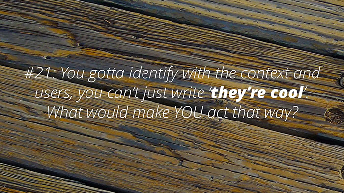
You need to understand your user base and you also need to facilitate and share this understanding with your team. If you don’t have sufficient research and don’t really understand the people you’re serving you can’t really explain this to your team. The stories you tell and the personas you explain won’t have depth or substance and this will impact the decisions the team make and the meaning their work has.
Don’t become the fountain of opinions — find empathy and share it with your team.
Sometimes we create experiences that drive off deep seated beliefs. We have to be aware of ourselves and what influences us so that we can understand if it’s coming from a place of wisdom or somewhere that is fuelled by strong but not necessarily valuable opinions.
Sometimes your team will go ‘really? REALLY?’ when you tell them that this isn’t going to work out for a user. Why? Because it’s hard to understand the perspective of a layperson when you’re in the position of expert. This again is about storytelling and conveying emotion. If you can explain how a user feels and the underlying motivations then your team are more likely to understand and share your view.
Communicate the risks, the user’s frustrations and intentions. Practice your storytelling, bring people to your research sessions. Give your sponsors and colleagues a reason to care about the experience.
Always participate in activities that are adding value. If you cannot understand how what you’re working on now will add value to the project you’re on, stop and find something else to work on. Don’t be afraid to let go of something.
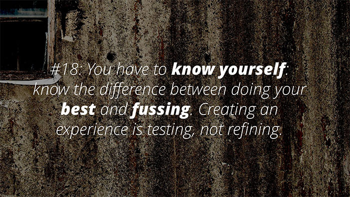
Check in with yourself. Hello? Are you getting carried away in design land? I do it all the time. I looove designing, spending time in Photoshop, trying different design angles. This is all very well and good — but check in with yourself and get up and test what you’ve done. Check in with users, check in with the team, and then you can get back to designing with the insight and direction your team and research provides.
This one’s pretty simple — you can’t make excuses for major design and usability flaws in your interface. I’ve heard it before “we’ll provide training” or “it was only one user”. Don’t make excuses and don’t rationalise a position that’s really based on not questioning the design, spending more time and money on getting it right.
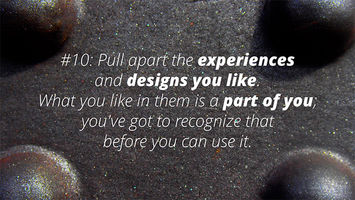
This is a great exercise to do when going into a project. If you can take apart similar or existing experiences/solutions and understand what makes them poor (or what makes them good) you can use this to inform the direction you take when building a new experience. It’s not necessary to limit it to your preferences either. It’s extremely useful to conduct UX tests on competitor or existing systems to understand flaws or current behaviour patterns.
When you research properly, you get to a point where you have a felt understanding of what a user context is. Meaning that you intuitively and experientially understand how they feel, what their circumstance is, and what drives behaviour. When you get to this point you’ll know it. From this point you can ideate from a platform of real understanding and have the potential to create a real experience — one that people see and agree that it’s the most obvious and common sense approach.
Define the core and simplest version of the experience you want to create. This will help you focus when you start diving down into creating the interaction design and identifying priority user stories. If you know that a successful experiences only needs a core set you can deliver that — as fast as possible and then expand from there if necessary.
Of course, these aren't really the hard rules of UX or even a comprehensive list—rather a simple adaptation of the Pixar storytelling version. Which stories would you have adapted differently?
Disclaimer: The statements and opinions expressed in this article are those of the author(s) and do not necessarily reflect the positions of Thoughtworks.


