Collaborative Sketching Sessions: a Framework
While there is much talk about collaborative and interdisciplina
Getting the team more involved in design decisions creates a deeper understanding and consideration of the end users. The designer will work as the facilitator and translator of insights, identifying meaning, extracting creative inputs and synthesising ideas that might solve the problem at hand.
As I started to apply and improve these collaborative sessions in the development teams I worked with, it became a fundamental part of the way those teams worked. The sessions are now known as Sketching Sessions. Here's how I typically run them.
The Sketching Session Setup
Before the session it's essential that you dedicate yourself to define the problem, identify restrictions, find the participants and material needed.
Define the Problem Well.
What do you want to solve with this session? Work on the problem with attention and care. You can call some people in to help you structure it. A well defined problem gives the activity focus and avoids participants getting lost in too many possibilities. Define it concisely, presenting the current possibilities for solving the problem, where the flaws are, what we want to fix and why.
Here's a structure I like to use that's inspired by Jeff Gothelf in Lean UX.
We'll visit two examples for visualization. The first one is about the creation of new functionality and the second one is about the improvement of an existing one.
New Functionality:
The Porto Alegre Como Vamos is a platform that facilitates the relationship between voters and their candidates so that the citizens of Porto Alegre know their candidate's proposals, and can engage when they are interested.
We observe that today there is no way to know how each city councilor gets involved in the voting for bills and what proposals each of them have created, which makes accessing he Counsel's portal difficult for users. It's confusing and does not give information back in a punctual and comparative manner.
How can we present such information in POACV in a clean, simple manner that's easy to navigate so that users can have access and generally demystifies the involvement of their councilors?
Improvement of Old Functionality:
The consultant's Internal System page is an information aggregator on the company's consultants, with filters and search options so that consultants can efficiently find other consultants within the company.
We observe that many of those filters are not used, some combinations don't give back the wanted results and more important filters get less highlight in the page, which makes the users confused and slows the search process, which should be simple and fast.
How can we improve the visibility and interactions of the more important filters so that the users get to the content they want in an agile, intuitive manner?
The best way to know if the problem is coherent is to validate it. Before the session, present it to the team members, the product owner, the stakeholders and even some users to make sure everything is contemplated in a clear and true manner.
Identifying the Restrictions of the Session
It is also important to call out the restrictions, both at the software level and for the purpose of the solution itself. Think, for instance, of the following questions:
- Should we avoid anything, given the type of user this solution is built for? (in a system where users are not good with a mouse, the solutions should be easily available through the keyboard, for instance).
- What is the most important platform right now: mobile? web?
- Data input or visualization, what is more important?
The restrictions assure that the session brings actual value to the final solution and they help the participants focus on ideas that can really fix the current problem.
Ideally the whole team should join in, but more than 10 people may make it unproductive. If the team is big, call people who can represent each area. If possible, bring in some stakeholders and people who are part of the process without being in the core development team. Sales or customer support representatives can often bring unique points of view.
Material needed:
- 2 A4 sheets per participant
- Sharpies for everyone
- 1 black and 1 red sharpie each, and some markers to highlight elements is enough
- Avoid thin point pens for they make it easy to draw tiny details we don't need at this point
During the Session
It's possible to get to excellent ideas and discussion within just 90 minutes.
Present the problem, the restrictions and the format of the session in the first few minutes. If important observations come up or if something is not right, discuss it with everybody to get to a plausible point from which the discussion can continue.
Make sure everybody is on the same page regarding the problem and the objective of the session.
The Format
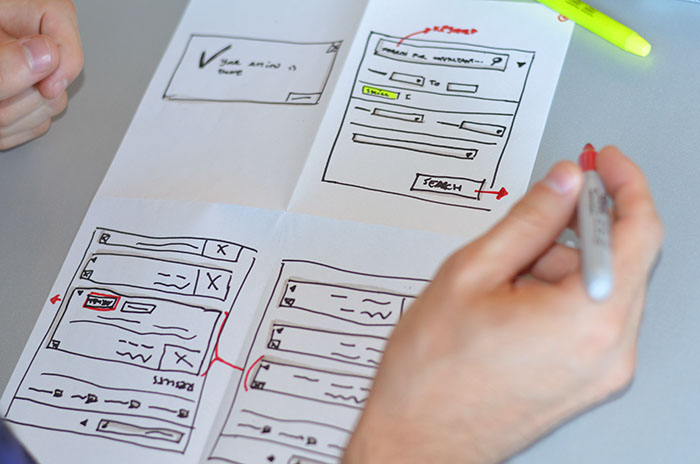
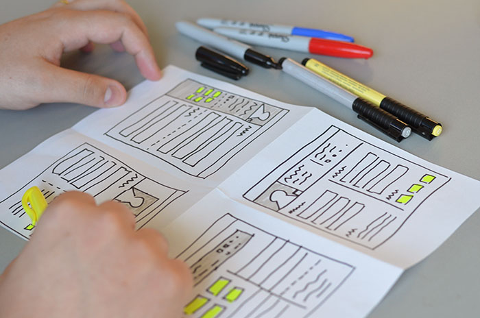
Two sketching rounds, with presentations. Pass around the sheets and pens, and ask everyone to fold each sheet in two twice, first vertically and then horizontally. Each quadrant formed by the fold will be an artboard for the activity.
The sketches can be of at least two types:
1. As a flow: When I click the button in the first quadrant, I go to the illustration in the second quadrant, and so on.

2. Or as four different ideas for the same problem.

It is worth reminding the participants that:
- It is not the final solution, so no need to focus on details
- It is not supposed to be pretty, it is supposed to get ideas out of heads
- It is not about quality, it is about quantity
- It is an experimenting exercise, so there is no such thing as a mistake!
The First Round
Allow 10 minutes to fill in the first 4 quadrants. Individually, all participants sketch what they think could fix the problem. You may find that some people are not comfortable sketching. For those people, show these ideas:
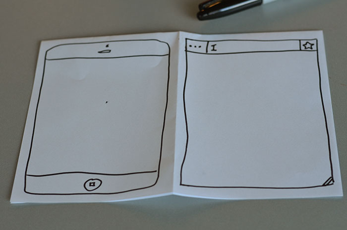
1. Staring at the sheet for too long before starting? Sketch the browser or the cellphone screen. A rectangle and a few buttons and there you go. It is easier to organize thoughts and feel confident to sketch ideas after that.

2. In these flat UI days, we only need three basic shapes: squares, triangles and circles. Anything can be drawn with these shapes.

Initial Presentations
If time is up, time is up! Now on to the presentations. Ask everyone to show and explain their work. Share the time equally between people so that everybody can talk. Give it a few minutes in the end for discussion, encourage reasoning on the implications and outcomes of each solution, clarify doubts about the mental model behind the participant's ideas. Take notes in a way that it is visible to everyone in the room.
Second Round
After the first round, participants will be more inspired and there will be more of an agreement on the initial ideas. The process in this round is the same: everyone will get 10 minutes to sketch individually in the 4 quadrants of the second sheet.
Final Presentations
Time is up, pens down! On to another round of presentations, this time with more room in the end for discussion. After the discussion, if you have an idea of what will be done next it is nice to inform the participants about the next steps and about any further conversations they can join in.
After the Session
What comes after the session is probably neither robust nor finished. It takes some analysis and synthesis to identify the value generated in the session; what may follow is navigation flows, detailed mockups, testable wireframes or prototypes, or even a list of questions without answers, in the form of hypothesis to be tested and assumptions to be validated.
Final Considerations
Involving the team in the sketching sessions encourages the collaboration and communication between every end of the project and lines up the understanding of the problem and the complexity of the solution, making everyone see more clearly the impact and effort that a design strategy and decision can generate.
Plus, the team feels part of the creation and not merely a step in the process, they get more motivated and responsible for delivering value, making the feedback and discussions that follow much richer and more constructive. Now it is on to tests and iterations!
Disclaimer: The statements and opinions expressed in this article are those of the author(s) and do not necessarily reflect the positions of Thoughtworks.


