It is cheaper to fix a mistake before you make it
Published: May 12, 2020
The popularity of design thinking in recent years has brought about renewed interest in paper prototyping - the use of simple paper sketches to communicate and test ideas with users.
In fact, prototyping is one of the fundamental steps in popular methodologies such as design thinking, design sprint and agile design. Don’t feel overwhelmed by the buzzwords - it is easier than you think.
When a leading insurance company partnered with Thoughtworks to rethink their car insurance application, their apps had poor reviews and customers complained about usability issues. We decided to leverage the power of prototyping.
Despite the abundance of prototyping tools available nowadays, paper prototyping is still one of the cheapest and fastest ways to make ideas tangible, testable and get the entire team to reflect and act on customers' insights.
When we started this project we all had different opinions on what the most useful functionality was. No one mentioned the “find your car”. We could have had an endless discussion, instead, we based our decisions on evidence. This process helped us focus on what users want, not on what we think they want.
Case study: Adding value to car insurance
Before starting, we thought about who we were designing for. We identified three categories:


Laura is a car owner. Mark, her son, got his license last month. Laura worries when Mark takes the car.

Max, shares the car with his sister Jane. They live in the city center and they don’t have a parking spot.

Elly works for a small company, she manages most things, including the four company cars.
For each category we associated a photo (photo credits: Pexels) and a name. During the all ideation process we kept asking questions like “Would this help Laura to monitor her son's car’s usage?”, “Would Elly consider this an efficient way to manage the company cars?”.
Analyzing information about the current service
Designers and developers sat together to understand what information we could surface to users without creating additional technical work. We identified the existing APIs and used the technological constraints to inform our design.

We read hundreds of reviews to understand what was working and what wasn’t. We grouped the reviews into categories, dividing the technical problems from the usability ones and trends started to emerge.

We used what we learnt from the reviews to craft a script and we interviewed 10 potential users. At this stage we had an initial idea of what people liked and disliked about the app. With the interviews we were after uncovering the Why behind certain comments in the reviews.
We focused on learning why people appreciated the Car Finder functionality and we discovered more about their behaviours:Generating ideas with the whole team
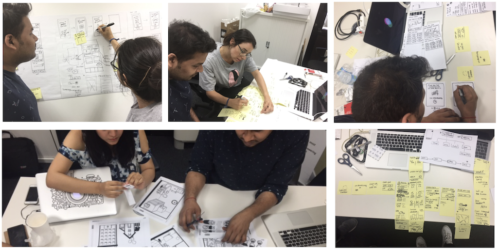
The most reliable way to come up with a good idea is to start with many. Fueled by the insights from the customers, we spent a few hours generating ideas with everyone in the team: stakeholders, developers, subject matter experts, analysts, data scientists.
My role was to facilitate the ideation session so everyone could contribute. The co-creation session agenda started with sharing insights from customers. Participants had the time to visualize their ideas with paper-prototyping and present them to the group for input. Ideas become stronger, fed by rounds of feedback and inspiration from other participants prototypes.
Encouraging a human-centered approach with storyboards
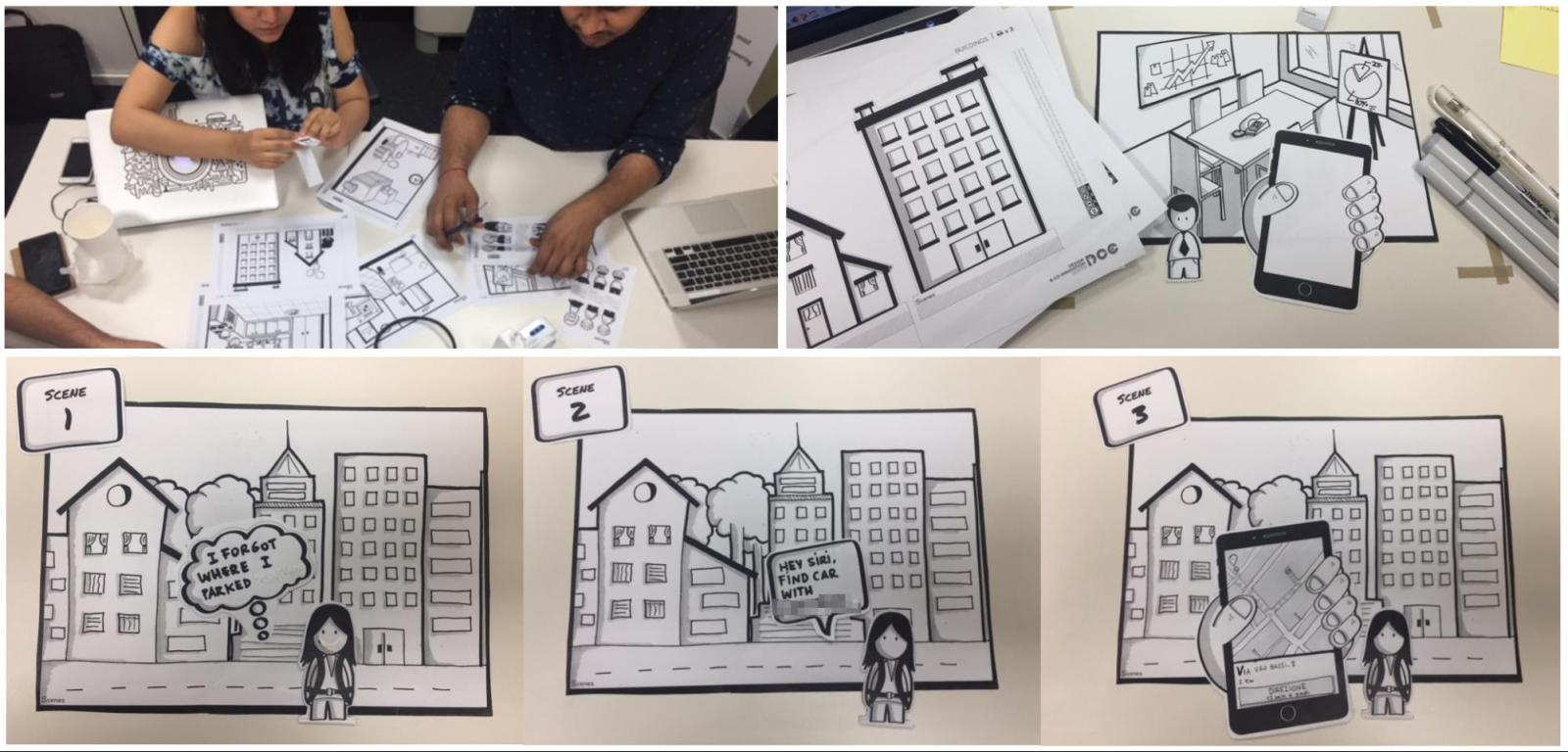
The Scenes Kit by SAP provides printable images of devices, environments and characters that can be arranged into storyboards. Breaking down the user experience into a sequence of scenes forces the team to visualize how users would behave at any given moment, what they would say and think. Reflecting on these micro-moments can really make the difference in crafting the user experience by uncovering opportunities to delight customers that could otherwise be overlooked.
Crafting paper prototypes with the best ideas
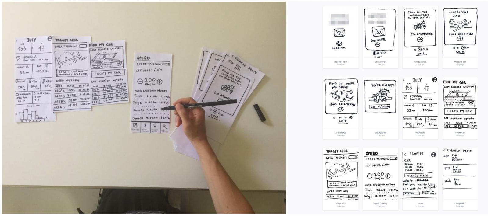
The team shortlisted the best ideas and crafted the prototypes. For the first round of testing, our focus was to check if our solution was solving the most common customer's problems. We drew multiple versions of the key functionalities and screens. Alongside the prototype, we crafted a narrative and some questions to get the most out of our interaction.
Showing the prototypes to potential customers
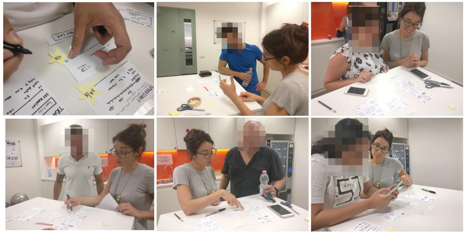
There is nothing as powerful as showing a prototype to potential customers to uncover new powerful insights. For the first round of testing, we showed the prototypes to six people. Each session was run by 2 people and lasted about 30 minutes, one person conducting the interview and one taking notes. We kicked off each session by sharing context on our project and goals, and we asked questions on the user's habits. The majority of our time with potential customers was spent reviewing the prototypes. To prompt the conversation, we asked open questions, and we listened carefully. At the end, we left time for any questions the customer might have.
Elena, an entrepreneur, said “My company has 5 cars. For me, it is easier to remember the car model than the plate number”. This comment triggered us to include the car model as an identifier along with the plate.
Andrea, a shop assistant, said “I park my car on Friday night and on Monday morning I can’t remember where it is”. People that share the same car with a relative or that park often in different places could use some help to find their car.
Evolving the prototype through round testing
Iterations are at the core of the agile design. To ensure that everyone in the team was exposed to the customer feedback first-hand, we created a rotation system. After running testing, the insights were shared with the rest of the group. The team listened carefully and shared ideas to evolve the prototypes accordingly. The most critical screen of the entire app was the dashboard. Tom, a student, told us "I monitor what I eat, my fitness activity and my finances easily from my phone. I want to do the same with my car." We asked potential customers to rate what information and activities they were likely to read or do more often. We used the top-rated info to craft the dashboard.

At each round, the prototype was increasingly meeting the users' needs. We went from an "assumption-based" prototype to an "evidence-based" one. Everyone in the team was able to validate and motivate our design decision by quoting users or describing their behaviours. Our prototype was getting closer to fit our target user's needs.
"I love this dashboard, I can clearly see when and where I have used my car!" said Nithya, receptionist, at the 4th iteration of the dashboard.

In summary, the key benefits of prototyping are:
Reducing risks by validating if the solution will actually solve the user’s problem and meet their needs.
Preventing costly rework by understanding users better and evolving the solution when it is cheaper to make changes, at a prototype stage.
In particular, the added value of paper-prototyping is:
Validating the solution in a cost-efficient and rapid manner as paper prototypes can be generated very quickly and cheaply and multiple evolutions of the prototype can be tested in a very short timeframe.
Improving customer experience by educating everyone in the team to make the best choices for the users by learning to listen, observe and act on the insights.
In one sentence:
In fact, prototyping is one of the fundamental steps in popular methodologies such as design thinking, design sprint and agile design. Don’t feel overwhelmed by the buzzwords - it is easier than you think.
When a leading insurance company partnered with Thoughtworks to rethink their car insurance application, their apps had poor reviews and customers complained about usability issues. We decided to leverage the power of prototyping.
Despite the abundance of prototyping tools available nowadays, paper prototyping is still one of the cheapest and fastest ways to make ideas tangible, testable and get the entire team to reflect and act on customers' insights.
When we started this project we all had different opinions on what the most useful functionality was. No one mentioned the “find your car”. We could have had an endless discussion, instead, we based our decisions on evidence. This process helped us focus on what users want, not on what we think they want.
Without getting customer’s insights, we would have missed the opportunity to solve the most critical problem.
Case study: Adding value to car insurance
Thinking about the target audience
Before starting, we thought about who we were designing for. We identified three categories:

- Parents who use technologies and who want to monitor their children's use of the car.
- Young couples or siblings who share the car while saving on insurance.
- Small companies that want to monitor employees' use of cars.

Laura is a car owner. Mark, her son, got his license last month. Laura worries when Mark takes the car.

Max, shares the car with his sister Jane. They live in the city center and they don’t have a parking spot.

Elly works for a small company, she manages most things, including the four company cars.
For each category we associated a photo (photo credits: Pexels) and a name. During the all ideation process we kept asking questions like “Would this help Laura to monitor her son's car’s usage?”, “Would Elly consider this an efficient way to manage the company cars?”.
Analyzing information about the current service
Designers and developers sat together to understand what information we could surface to users without creating additional technical work. We identified the existing APIs and used the technological constraints to inform our design. 
Finding out what customers think
We read hundreds of reviews to understand what was working and what wasn’t. We grouped the reviews into categories, dividing the technical problems from the usability ones and trends started to emerge. 
- “Not useful” - the app doesn’t do anything useful for me
- Not very useful apart from the Car Finder.
- I like the car insurance validity feature.
Getting feedback from real users
We used what we learnt from the reviews to craft a script and we interviewed 10 potential users. At this stage we had an initial idea of what people liked and disliked about the app. With the interviews we were after uncovering the Why behind certain comments in the reviews.
We focused on learning why people appreciated the Car Finder functionality and we discovered more about their behaviours:
- 7 have forgotten where they parked at least once
- 3 often forget where they park
- 5 stated that the functionality they would use most often is the “Car Finder”
- 6 are suspicious of providing their data
- 2 are interested in monitoring their car data
- 3 are interested in observing other driving data
Generating ideas with the whole team

The most reliable way to come up with a good idea is to start with many. Fueled by the insights from the customers, we spent a few hours generating ideas with everyone in the team: stakeholders, developers, subject matter experts, analysts, data scientists.
My role was to facilitate the ideation session so everyone could contribute. The co-creation session agenda started with sharing insights from customers. Participants had the time to visualize their ideas with paper-prototyping and present them to the group for input. Ideas become stronger, fed by rounds of feedback and inspiration from other participants prototypes.
Encouraging a human-centered approach with storyboards

The Scenes Kit by SAP provides printable images of devices, environments and characters that can be arranged into storyboards. Breaking down the user experience into a sequence of scenes forces the team to visualize how users would behave at any given moment, what they would say and think. Reflecting on these micro-moments can really make the difference in crafting the user experience by uncovering opportunities to delight customers that could otherwise be overlooked.
Crafting paper prototypes with the best ideas

The team shortlisted the best ideas and crafted the prototypes. For the first round of testing, our focus was to check if our solution was solving the most common customer's problems. We drew multiple versions of the key functionalities and screens. Alongside the prototype, we crafted a narrative and some questions to get the most out of our interaction. Showing the prototypes to potential customers

There is nothing as powerful as showing a prototype to potential customers to uncover new powerful insights. For the first round of testing, we showed the prototypes to six people. Each session was run by 2 people and lasted about 30 minutes, one person conducting the interview and one taking notes. We kicked off each session by sharing context on our project and goals, and we asked questions on the user's habits. The majority of our time with potential customers was spent reviewing the prototypes. To prompt the conversation, we asked open questions, and we listened carefully. At the end, we left time for any questions the customer might have.
Elena, an entrepreneur, said “My company has 5 cars. For me, it is easier to remember the car model than the plate number”. This comment triggered us to include the car model as an identifier along with the plate.
Andrea, a shop assistant, said “I park my car on Friday night and on Monday morning I can’t remember where it is”. People that share the same car with a relative or that park often in different places could use some help to find their car.
Evolving the prototype through round testing
Iterations are at the core of the agile design. To ensure that everyone in the team was exposed to the customer feedback first-hand, we created a rotation system. After running testing, the insights were shared with the rest of the group. The team listened carefully and shared ideas to evolve the prototypes accordingly. The most critical screen of the entire app was the dashboard. Tom, a student, told us "I monitor what I eat, my fitness activity and my finances easily from my phone. I want to do the same with my car." We asked potential customers to rate what information and activities they were likely to read or do more often. We used the top-rated info to craft the dashboard.
At each round, the prototype was increasingly meeting the users' needs. We went from an "assumption-based" prototype to an "evidence-based" one. Everyone in the team was able to validate and motivate our design decision by quoting users or describing their behaviours. Our prototype was getting closer to fit our target user's needs.
"I love this dashboard, I can clearly see when and where I have used my car!" said Nithya, receptionist, at the 4th iteration of the dashboard.

Takeaway
In summary, the key benefits of prototyping are:
Reducing risks by validating if the solution will actually solve the user’s problem and meet their needs.
Preventing costly rework by understanding users better and evolving the solution when it is cheaper to make changes, at a prototype stage.
In particular, the added value of paper-prototyping is:
Validating the solution in a cost-efficient and rapid manner as paper prototypes can be generated very quickly and cheaply and multiple evolutions of the prototype can be tested in a very short timeframe.
Improving customer experience by educating everyone in the team to make the best choices for the users by learning to listen, observe and act on the insights.
In one sentence:
Looking back, where could you have utilised paper prototyping?
It is cheaper to fix a mistake before you make it.
Disclaimer: The statements and opinions expressed in this article are those of the author(s) and do not necessarily reflect the positions of Thoughtworks.


