Enable javascript in your browser for better experience. Need to know to enable it? Go here.
Blogs Banner

UI components by design

Over the past few years, software designers have been iterating on methodologies to make large-scale digital design repeatable and scalable, such as Atomic Design or design systems, optimizing for tools such as Sketch. But a robust design system’s impact is diminished if the development team is unaware of it or does not implement it.
 
Software developers have been spending equal time honing frameworks for creating living style guides to visualize and reuse UI patterns, plugging in to new user interface libraries such as React. However, a style guide becomes a burden when it falls out of sync with the latest designs or with the actual application.
 
The problem is that these cutting-edge methods and tools target only one side of the craft. A gap continues to plague Web design and development. And in the middle is a one-way hand-off that lacks consideration for both sides.
 
On my most recent project, I worked with a team of User Experience (UX) designers and User Interface (UI) developers in an attempt to close the gap. We were charged with designing, building, and scaling a user interface with a consistent visual and interactive experience across multiple front-end applications for a large enterprise project. Along the way we merged ideas from design systems and style guides with modern UI development thinking, resulting in a successful, component-oriented approach to UX design and UI development. In this article, I’ll share the process, philosophy, and practices that we used.
 
One of the primary keys to our success was strengthening that crucial hand-off point. However, doing so first required a change to our mental model of the core unit of design and development.

Express design as working components

Components let you split the UI into independent, reusable pieces, and think about each piece in isolation". (source: Facebook)
 
source: A Hello World component from the React documentation.
The developer-focused ideas that are driving the component architecture in Web applications are not new to designers. Designers can draw a parallel between frameworks like Atomic Design and the popular concepts coming out of the React community. Even the term 'component' is getting use in the design community. Designers are already accustomed to breaking down a UI into hierarchies and designing for consistency.
 

Convergence of language

What’s new is the emergence of a common language between designers and developers. Without it there has been a barrier to communication and understanding, manifesting itself in conversations like this:
 
What the designer says:
“Make this new feature look like the drop down menu in this mockup.”
“And when it’s clicked, it should ease down naturally.”
 
What the developer hears:
“A drop down menu, that’s probably a <select> tag.”
“I need to copy the CSS class names from this other drop down.”
“I need to write some JavaScript to make it go down, or I need to write some CSS to animate it, or maybe both… What does ‘ease’ mean?”
 
Though both the designer and developer are thinking in a way that makes sense to themselves, they’re speaking different languages. As a result, the conversation’s fraught with misinterpretations and mistakes.
 
If we align on a common language that conversation could change. It could become more straightforward and less error prone.
 
Designer: “For this new feature, let’s plug in the ExpandingMenu component here.”
Developer: “Okay!”
 
So, the first goal on my recent project was to adopt a common language, based on components, across both design and development. More importantly, rather than a component referring to a static object in Sketch or Illustrator, we wanted it to refer to a real, working piece of software.
 

Two Types of Components​

We found it useful to distinguish between two types of components from a design perspective to help us separate concerns:
 
  1. Foundation Components are the primary expression of the design language of the system. They’re the defining parts of the experience, and very targeted in scope. They ensure a consistent underlying interface. UI Developers on the design team will build them.
  2. Application Components are specific to one of the applications being built, and not seen as a defining, foundational part of the UI. They’re usually larger in scope, and almost always composed of one or many Foundation Components. Some Application Components may eventually transition into Foundation Components. The application teams will build them.

This distinction helped us scale by leaving space for UI developers on the design team to elaborate on intricate interface details in Foundation Components, while allowing application developers to compose them into larger components at the same time.
 
Because we were building form-heavy applications, our Foundation Components revolved around user input, such as Button, TextField, and RadioGroup. But there is no one-size-fits-all library of components here. If you were building a chat application, your Foundation Components might include ChatInput, Message, and ProfilePic.
 
Breaking down design and UI development like this leads to some interesting questions:
  • How do you decide which parts of the design should be Foundation Components?
  • Doesn’t this create a lot of dependency on the design team to churn out Foundation Components?
  • How do applications consume the Foundation Components?
These challenges forced us to develop to a workflow that could scale to many teams while producing consistent, easy to compose Foundation Components.

A component-centric workflow

The design team’s guiding principle was to use real, working components as the primary means of sharing the UI with application developers, instead of more traditional design artifacts such as wireframes, mockups, style guides, or prototypes. While we continued to design using these existing tools, we immediately implemented React components that could be directly used in an application and then fed back into new designs.
 
Over time, we converged on the following workflow. It is a circular flow marked by tight feedback loops between designers, UI developers, and application developers.
 
Building tight feedback loops
 
Figure 1: Building tight feedback loops

Design

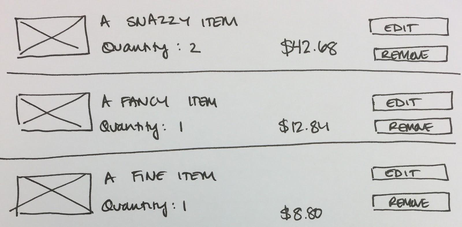
A designer starts by designing a part of the experience, keeping in mind the overall context of the application and the current components available in the design language. This might result in a simple, hand-drawn sketch like this shopping cart.


You will notice that this is only a partial design, zoomed into only one aspect of the overall shopping experience. Designing by way of lightweight, hand-drawn sketches may feel uncomfortable to you, but helps to avoid heavy, expensive up-front design.
 
As an application design materializes, break it down into its composite parts, its components. Think: “What are the consistent building blocks here that have meaning in the overall experience?
 
The exploded views below represents a possible breakup of some of the components for this shopping cart example. There are some Foundation Components that we will be reused many times throughout the application: Heading, BodyText, and Currency.


And there are some Application Components that are more complex, and composed of other components: CartItem, and CartItemList. These may only be used in this one part of the experience.


But, this design has something new, a new candidate component: a button.
 

Isolate and elaborate

The designer collaborates with a UI developer to isolate core UI elements so that they can elaborate on their structure, appearance, and behaviors. In a component architecture, components are independent and reusable across various contexts. Isolating a component from its original design helps ensure that it is decoupled, while still being connected to the overall design. The result of these steps will result in a specification for a new component to be coded.
 
In our new design, we actually have three buttons.


While you may be thinking, “It’s just a button”, there is actually a lot to uncover.
  • There seem to be two, or maybe three, styles of button. How is each one styled?
  • Can the buttons be disabled at this point? If so, what does the disabled state look like?
  • Are there any accessibility considerations?
  • What presentation adjustments are necessary for mobile devices if we support that?
  • When the buttons are clicked, should they show feedback that something is happening?
What often seems like a simple element actually has many aspects to consider. But it helps to be disciplined at constraining scope and avoiding future-proofing. Consider the technical implications of a design. Pairing a designer and UI developer helps to ground the designer’s designs with the realities of development. Drive at the minimal amount of work necessary to produce a useful component, leaving out things that you don’t need right now.
 

Build

Using the agreed specification, the UI developers build the Foundation Component as a React component.
 

 class Button extends React.Component {
  render() {
    const className = this.props.primary ? "primary-button" : "secondary-button";
    
    return (
      <button classname="{className}" onclick="{this.props.onClick}">
        {this.props.children}
      </button>
    );
  }
  While I’ll get into a few more of the technical concerns in the next section, the most important concern for the UI developers is to decouple the Foundation Component from the application. Foundation Components are opinionated, yet flexible, and application-agnostic. They must be able to integrate into multiple places within the application, or across multiple applications. Make a clear distinction between UI logic and state that is owned by the Foundation Component, and application logic and state.
 
Our new Button Foundation Component is a simple case. It owns the logic of choosing its CSS class name based on a given 'type' property, while allowing the application to provide a callback through the 'onClick' property, which will be invoked when the button is clicked. The Button does not know what to do when it is clicked, except that it needs to call the function provided to it by the application, which will be different for every use.
 

Integrate and Learn

Foundation Components are published so that application developers can bring them into applications and assemble them into larger, more complex components. New components are fed back into the design process so they can be reused and iterated on.
 
import {
 Heading, Inline, BodyText, Currency, Button, Link
} from “foundation-components”;

class Cart extends React.Component {
 render() {
   return (
     <form>
       <Heading>Your Cart</Heading>
       
       <CartItems />
       
       <Inline>
         <BodyText>Order Total</BodyText>
         <Currency>{this.props.orderTotal}</Currency>
         <Button primary onClick={this.props.doCheckout}>Checkout</Button>
       </Inline>
       
       <Link>Continue shopping</Link>
     </form>
   );
 }
}
 
Abstracting the component behind a small, but flexible, interface makes it easy for both designers and developers to discuss it. Rather than fussing over which class name to use or which jQuery plugin to run, the application developer’s focus shifts to composing the Foundation Components with their application-specific components and logic to deliver business value.
 
Don’t overlook the power of using a component over plain HTML, CSS, and JavaScript. Far too often, interfaces are broken because a CSS class name is renamed or a jQuery selector is mis-typed. When you build your application using components, those problems disappear.
 
Over time, a rich library of Foundation Components, driven by your particular use cases, will be built up and fed back into new designs. But how do you manage this component library? How do you talk about it? How do you make it valuable?

Treat Foundation Components as a product

As we followed this workflow, we needed a way to talk about what we were doing and why we were building the UI this way. So, we crafted a value statement for our component library:
 
The UI component library is the expression of the visual and interaction design for the product. It enables teams to build consistent interfaces quickly by giving them the building blocks for their applications. Application developers focus on implementing complex business logic, rather than fussing over user interface details".
 
Defining the business value for the library of Foundation Components helped to make the case for more product-centric processes, ensuring success. Because it was more than ‘some technical thing', we were able to create buy-in for a work-intake process, quality assurance, and an ownership model. We would not have been as effective at driving adoption and iteration of the process if we had treated the component library as a purely technical solution aimed merely at reducing duplication.
 
We also knew that, as a product, it was crucial to delight our customers, who were mainly application developers. They needed to be able to easily connect the Foundation Components to application logic and quickly deliver value, without becoming overly dependent on the design team. We put a lot of effort into making it as easy as possible for application developers to understand and use the components, even while we were in heavy development. Some of our practices were:
 
  • Publish the component library as an npm package using semantic versioning so that developers can make reasonable assumptions about new versions.
  • Stabilize component APIs quickly so that breaking changes are less likely as Foundation Components evolve.
  • Deprecate changing APIs and remain backwards compatible whenever possible so that developers can upgrade easily.
  • Communicate changes to developers on-time so that they remain aware of new features.
  • Write straightforward documentation using plain language so that developers know how to use the components.
  • Show example usage of components to create a self-service environment, reducing the dependency on the UI team.
 
We also used the amazing library react-styleguidist as a development environment while creating new components, and then as a documentation and component showcase site for everyone consuming the library. Highly recommend!
 
source: https://react-styleguidist.js.org/
 

Reflections and the future

While we considered our approach a success, it was not all roses. At the end of the day, there remained two sources of truth for a component: the original design artifacts housed in a design tool (usually Sketch); and the React components housed in the foundational component library. We often ran into problems because those could still get out of sync.
 
The most common problem we experienced was accidentally using a Foundation Component in a new design in a way that was not yet supported by the component. We would often realize that too late, when the application team was trying to use it, causing integration pain and back-tracking on the design.
 
This space is constantly improving, and the potential here is huge. I’m especially excited about a new tool from Airbnb called React Sketch.app, which allows you to render React components to Sketch. There are also others in the community talking about this intersection between designers, developers, and components. I can imagine a not-too-distant future in which the line between design and development completely fades away, and we are collaborating using the same language, abstractions, and tools.
 
(Much love to my colleagues Angelina Cole and Matthew Brown for their help and feedback while crafting this article.)

Disclaimer: The statements and opinions expressed in this article are those of the author(s) and do not necessarily reflect the positions of Thoughtworks.

Keep up to date with our latest insights