In the past two years, the market for smart TVs has grown rapidly. They are now one of the main ways in which people interact with media at home — particularly in smart homes. For this reason, developing TV apps that take full advantage of the smart TV medium is more important than ever and can give organizations a new way of connecting with consumers.
To a certain extent, there are some similarities between building mobile apps and building apps for TVs. However, there are some important differences that developers need to consider:
Larger screens: Televisions offer larger screens than mobile devices. Users will likely have higher expectations of what the visual and auditory experience will be like.
Remote controlled: Operations on a TV can’t be as precisely controlled as mobile devices. They instead require a remote control device to select items and execute click operations.
Multi-user usage scenarios: Televisions are shared devices within the household. This means developers must consider multi-user scenarios and make it easy to create and switch between user accounts.
Large screen
UI layout for televisions
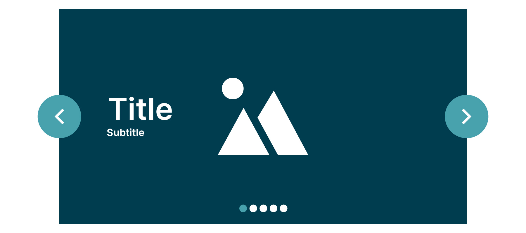
TV layouts should be easy to use; that’s why it’s important developers prioritize simple and intuitive design. The carousel layout is an ideal option for displaying current TV programs and recommended movies through multiple slides. This layout comprises a full-screen immersive background image and a content block with low information density to avoid content overload and prioritize the main information. The content displayed can alternate automatically within a specified time. This makes it ideal for showcasing important content on large screens.

Multi-resolution image resources
TV devices come in different screen sizes and pixel densities. Not taking these variations into account can cause blurry or distorted images because of scaling. To ensure good graphic quality on devices with different pixel densities, multiple versions of image resources should be provided for each density level with the correct corresponding resolutions.
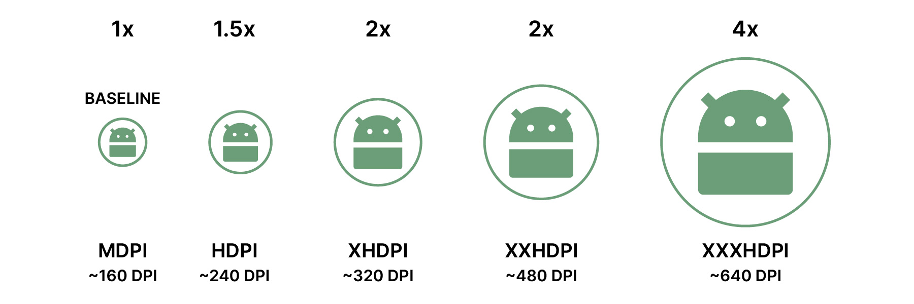

Assuming the application needs to provide five different image resolutions, two methods can be used:
The backend API returns URLs for five different images that will be used for the different resolutions
We can pass the resolution value as a parameter into the API request so we can retrieve the image with the corresponding resolution size
Multi-view
Larger screens also make it possible to display multiple things simultaneously. This can be useful for content display pages.


Furthermore, for things such as sports that are already shot from multiple camera angles, providing a playback option that directly enters into a multi-view mode can be a great way of offering users the ability to simultaneously access more information.
Remote-controlled
Login by QR code
Typing on a TV using a remote is frustrating, especially when entering complex usernames and passwords. A better option is to allow users to log in using a QR code. They can scan the code on the TV screen with their phone, which will take them to a web page with the authorization code. This makes logging in faster and easier. When designing TV applications, it's important to consider the differences between mobile touchscreens and TV remotes.


Focus handling
For the scenario where users use a remote control for directional interaction, platforms have provided frameworks that allow automatic navigation, such as Google's Leanback framework for the Android platform. However, developers need to pay attention to the following scenarios to avoid confusing users.
Scenario 1: Switching focus between unrelated rows
The Leanback framework may select the wrong focusable element when users switch between unrelated rows, causing confusion. For example, if a user is focused on Tile3 in Row1 and presses the down key to switch to Row2, the expected tile to be selected should be TileA, but the framework may automatically focus on TileC instead.
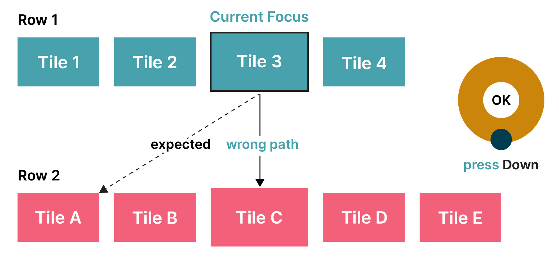

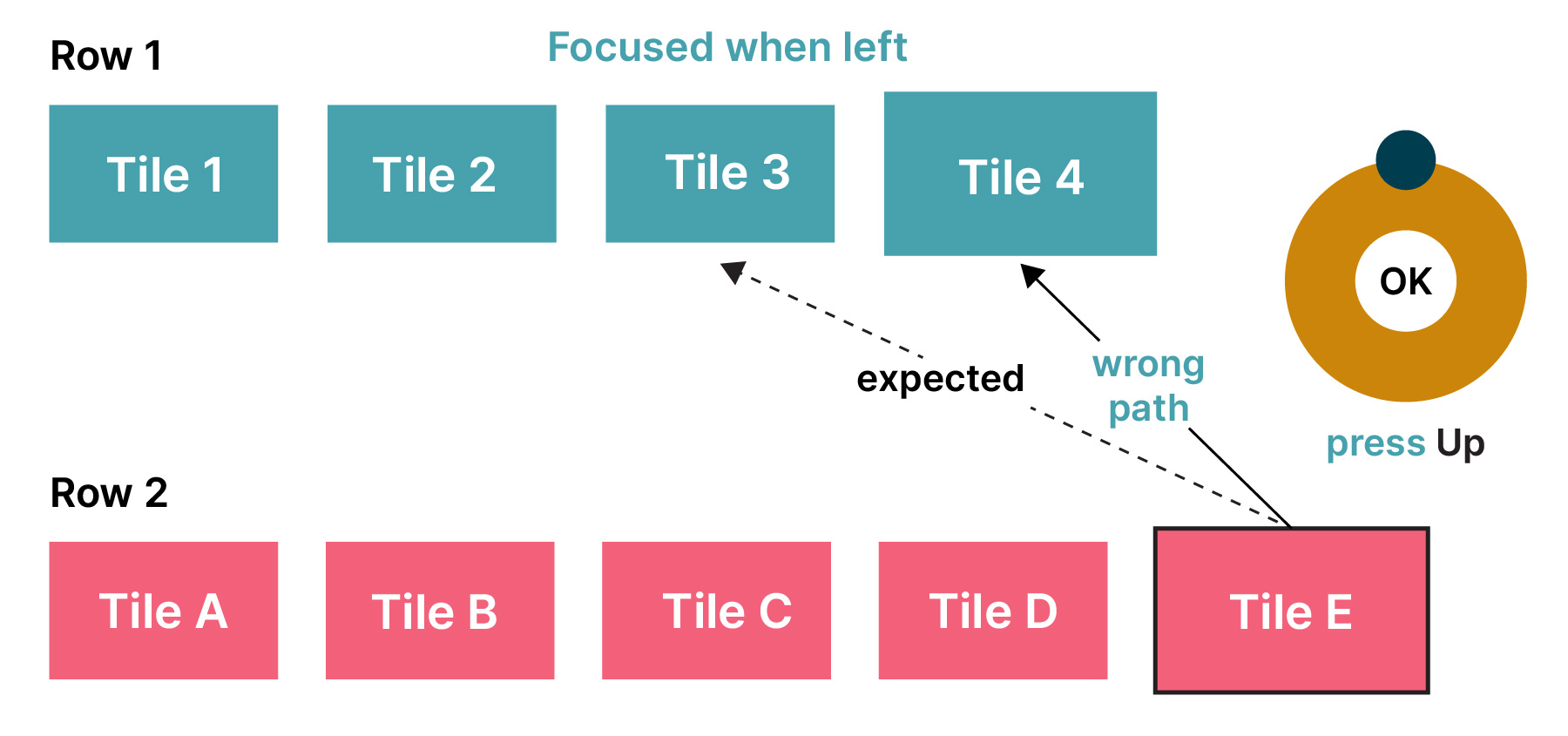

Two ways to avoid diagonal navigation: always keep the focused element displayed as the first item in the row or maintain the focusable attribute only for the last focused tile when the focus row changes. It solves the problem of losing the navigation history in a diagonal direction.
Scenario 2: Switching the cursor position within the input field
Developers can intercept the key events of the left or right direction keys and customize the processing logic to avoid the Leanback framework moving the focus from the text input box to the nearest focusable element when users adjust the input cursor position in the text input field on Android TV using their remote control.
Key handling
TVs and set-top boxes have varying remote controllers, including keyboards and gamepads. As a result, careful consideration is required to ensure application responds correctly to user inputs.
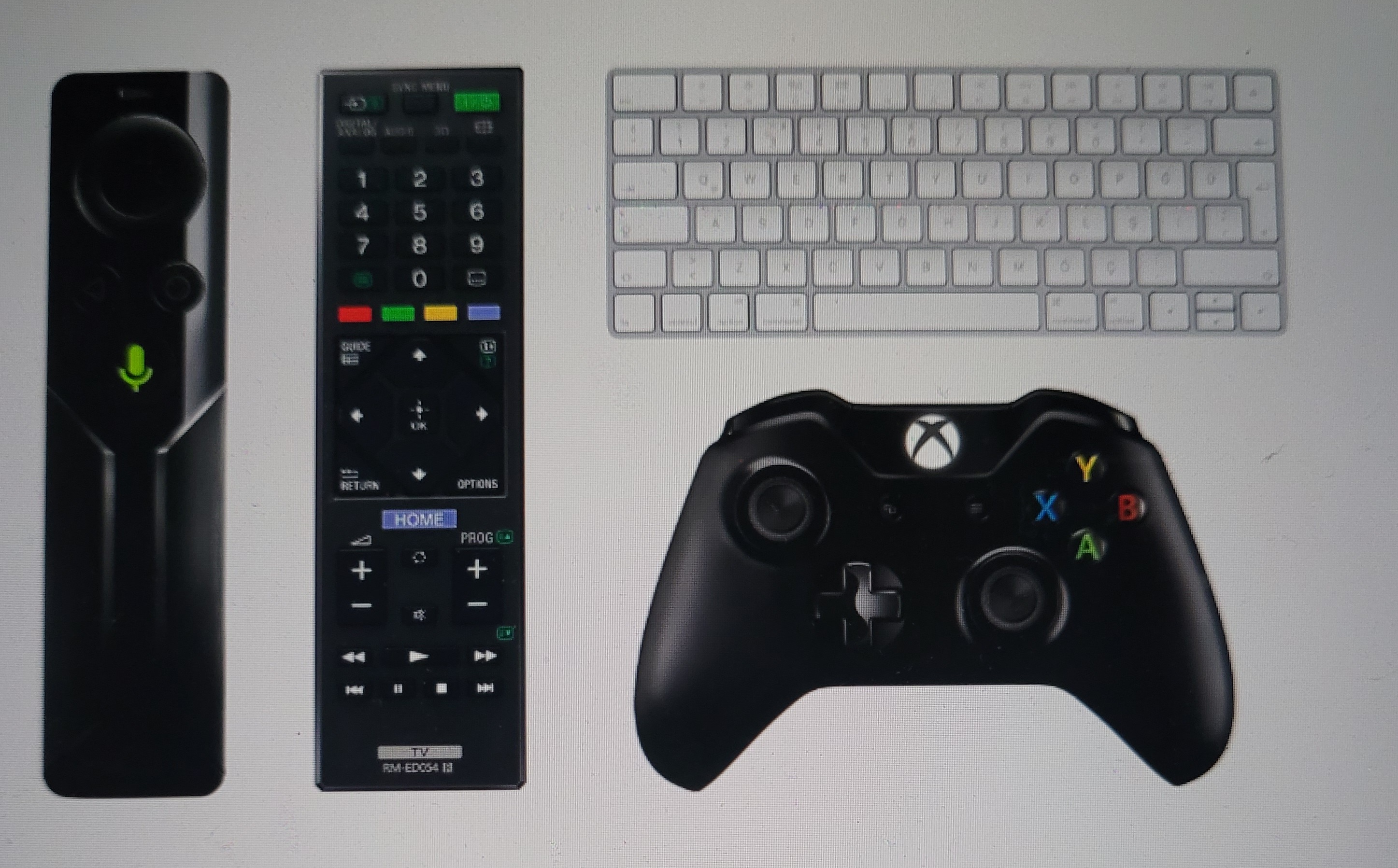

When developing the response of button functions for TV applications, ensure functional consistency across different devices. For example:
When pausing a video, it is necessary to consider the various buttons on the remote control, such as PAUSE, PLAY/PAUSE and CENTER.
Various methods are available for moving the focus, such as directional buttons on the remote control, keyboard or trackpad gestures.
Both the remote control's BACK button and the keyboard's ESCAPE button are viable options for returning.
Special keys can enhance the user experience, like the search button opening the search interface and numeric keys directly jumping to corresponding list items. Lastly, buttons have two states — pressed and released — and long press logic can enhance user interaction, such as holding the directional key for fast-forwarding with a time indicator for caution.
Multi-user usage scenarios
Fast user switching
A TV is a shared device among multiple users within a household. It’s important to allow users to switch accounts to access their own personalized playback progress and favorite programs.
A best practice is to add a profile switch button on the splash screen and display current profile information. Users can simply press the confirm button during the splash animation to access the profile selection page, making it easy to switch to their own profiles every time they open the TV and launch the application.
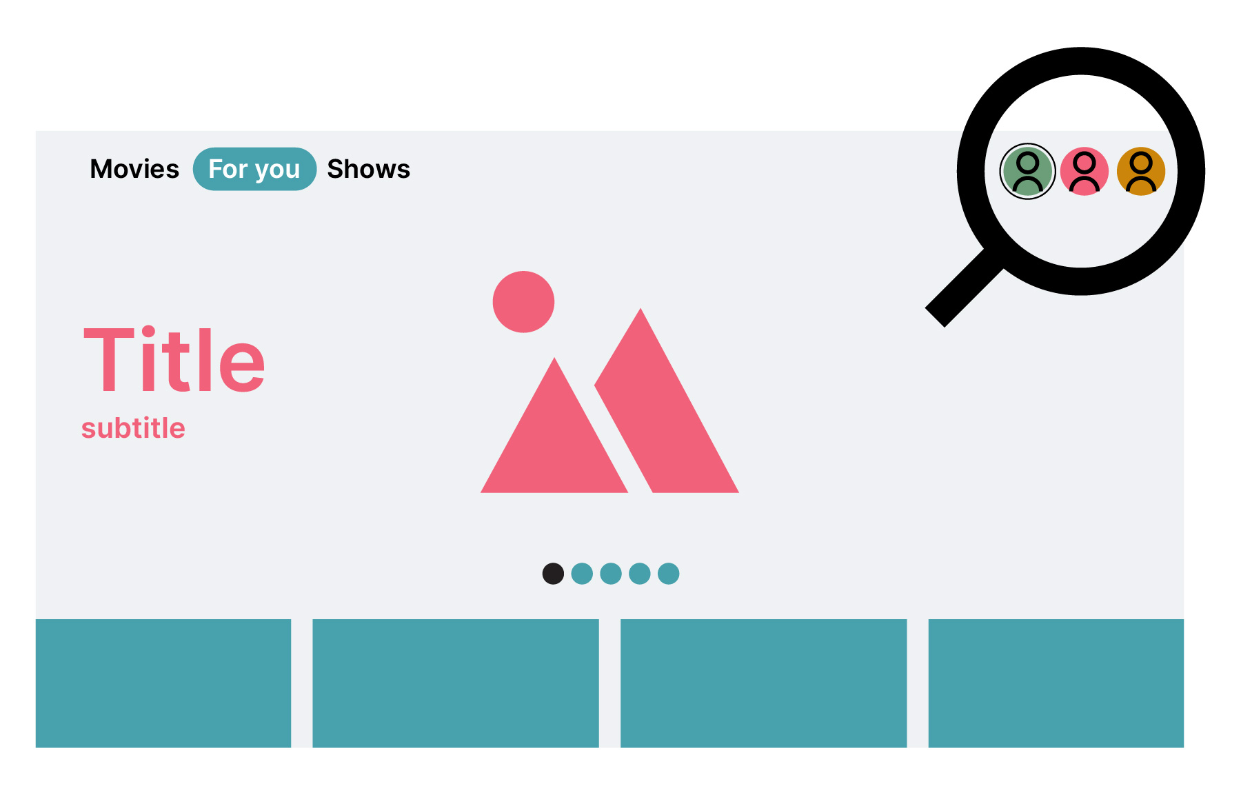
In addition, adding an account avatar to the navigation bar is a good choice for switching profiles. That way, the application can resume from the background without displaying the splash screen.

Navigation Indicator
TV navigation differs from touch screen devices, and developers need to make it feel familiar to users. Navigation should be quick and easy with minimal remote clicks. What’s more, the back button on the remote replaces the need for a virtual back button in the interface.
TV apps typically have a browser view and a detailed view. The browser view is the entry point, while the detailed view provides more information about selected content. The app should display the current page hierarchy to help users understand their location.
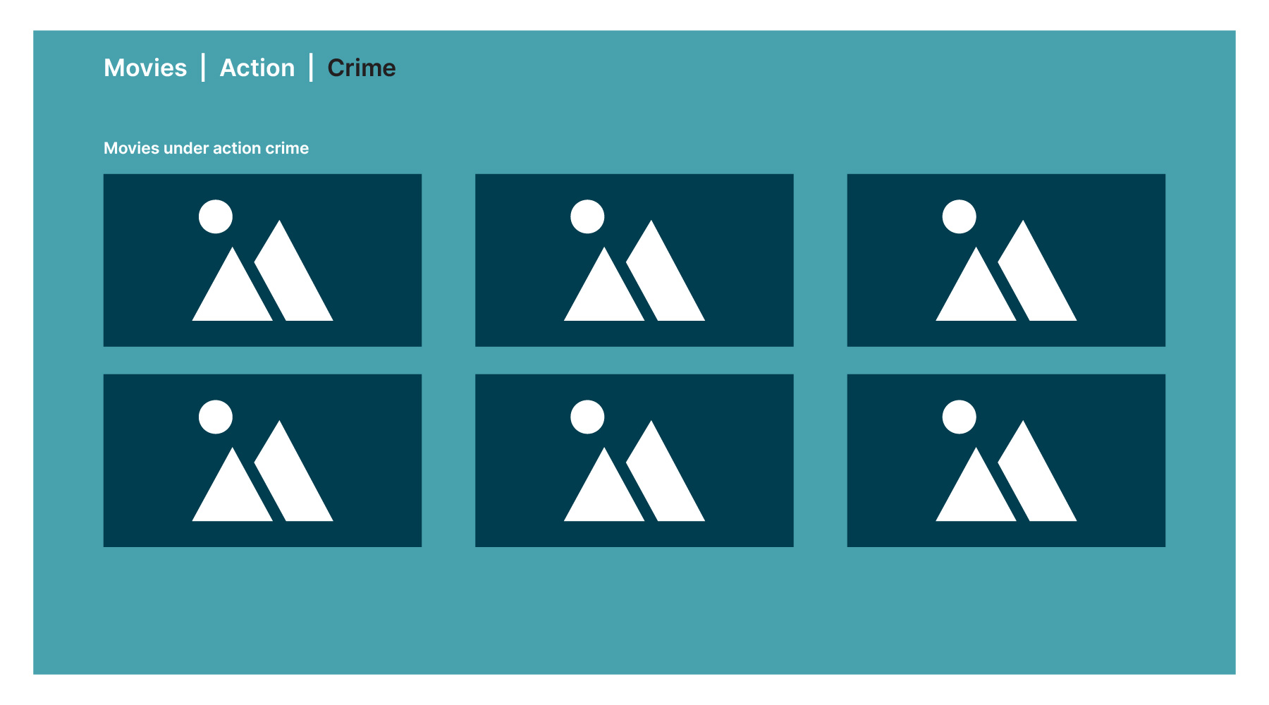
The navigation bar indicator displays the current page hierarchy as the user browses through the app, such as "Movies | Action | Crime" when moving from the "Movies" page to the "Action" category and then to the "Crime" subcategory.

Summary
Developing an Android TV application involves various unique considerations and has its own unique challenges compared to mobile app development. To provide an engaging and user-friendly experience, developers should focus on three main aspects: large screen design, remote control interactions and multi-user scenarios. This will provide a seamless and intuitive user experience and encourage user to use smart TVs to their full potential.
Disclaimer: The statements and opinions expressed in this article are those of the author(s) and do not necessarily reflect the positions of Thoughtworks.


