
Adjusting to the Agile UX Workflow
Working as part of an agile development team for the first time can be difficult for UX Designers. You need to adjust the way you work and find a different rhythm.
This transition can be difficult to make as it’s often about subtle differences rather than a complete change of job. You’re still solving the same problems and doing the same tasks. The difference is in the way you structure your workflow.
For some designers this change comes naturally. For others it can be challenging, confusing and frustrating. I’ve seen some designers figure it out in just a couple of iterations. Whereas others have struggled through projects for a year or more before finding their groove.
The good news is that it’s a transition worth making. Once you’ve experienced the benefits of working collaboratively in an agile team, you can never go back. Once seen your ideas come to life while the ink it still wet on your mockups, the idea of working any other way will seem ridiculous.
Over the last few years, I’ve been through the transition myself and helped coach other designers through it. This is the approach that works for me. It’s not prescriptive, nor perfect. Every individual is different. Every team is different. You have to find their own way, but this is the advice I wish someone had given me to ease the transition.
Start by setting a vision
Set a vision, then iterate through the details. Don't try to create a prescriptive end-state before development starts. Being agile is all about working iteratively and adapting as you learn. It’s about putting a marker on map and working through the challenges required to get there. Don't try to list out turn-by-turn directions for every step of the journey before you’ve even started.
Designers play a key role in helping the team start with a shared vision and mental model. Our ability to think visually and articulate an experience can help a team start heading down the right path together.
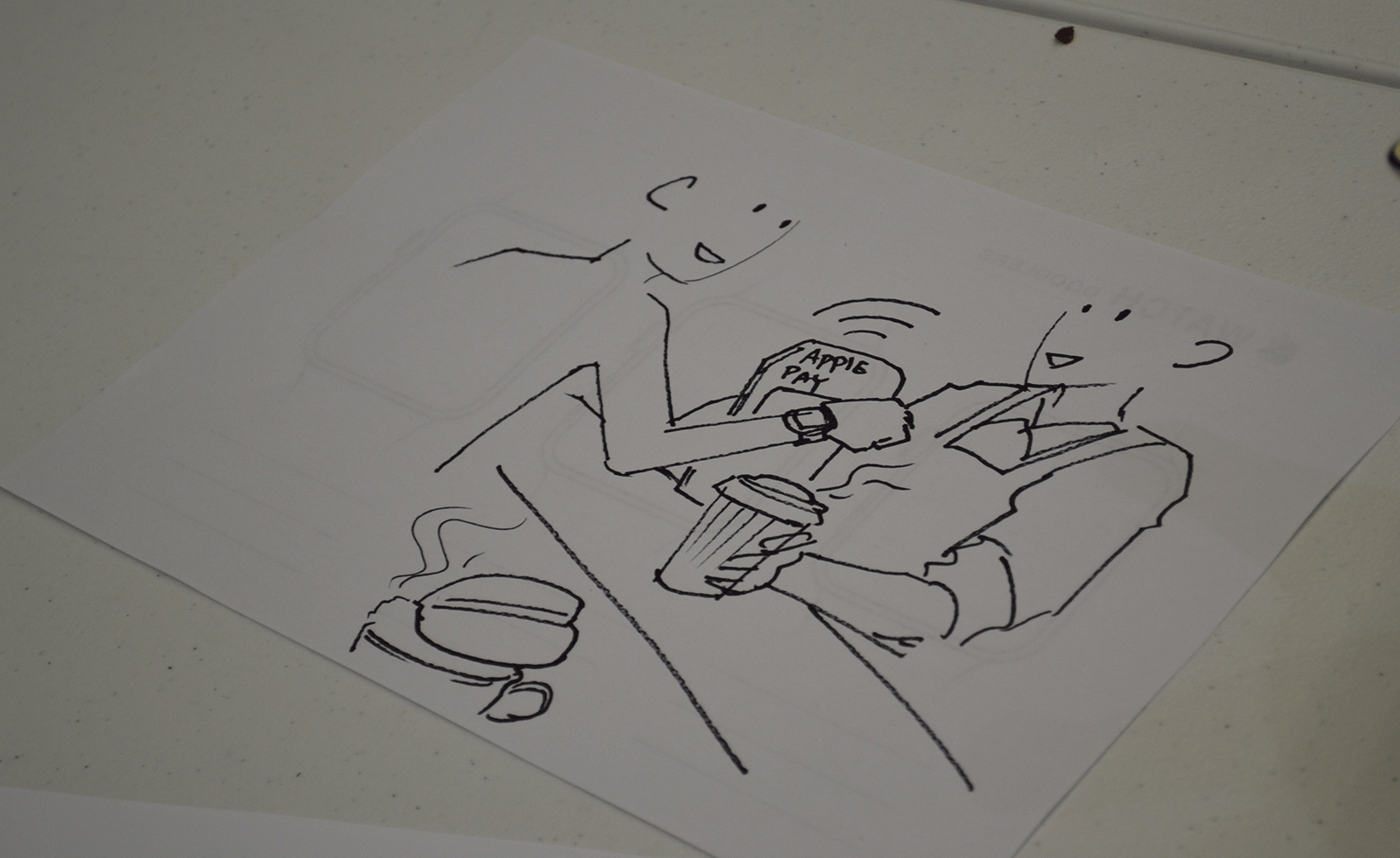
There are lots of different ways to communicate a vision. Customer journey mapping combined with low fidelity prototyping tools are usually my default approach. Hand-drawn sketches showing the core page-flow gives a tangible view of the experience we’re trying to create.
This is just one approach. Other useful tools include design principles, empathy mapping, value proposition canvass, service mapping, story mapping, the list goes on. Regardless of the tool, what is important is not overinvesting or trying to lock down the details. Set the direction then let the details emerge as the team builds the product.
The caveat with all this is that sometimes a little upfront design is required. Sometimes it’s necessary to delve into the details a little, usually for estimations and resource planning. If you need to do this, consider depth versus breadth. If you need to, spike out one feature in detail to get sense of the details. That can help you extrapolate the effort required to build the rest of the product. Just don't let it turn in to Big Upfront Design by spiking every feature in detail. A good focussing question for this is “what is the minimum we need to know to start building?”
Don’t try to build the full vision
Start simple. Then iterate and enhance the product over time. Business owners and designers usually jump to what the mature product could look like one day. They see the end-point once every feature idea has been built. I call this ‘blue sky designing’. It’s jumping ten steps ahead of yourself.
Mature products take years to build. Chances are that is what is contained in the vision that is up on your wall. That’s good, it means you have an ambitious goal to work towards. But every journey starts with one step.
Don’t start by trying to design the perfect end-game solution. Ask the question “What is the simplest possible way we can meet a customers needs?” Design and build that first. It's a harder design challenge, but more efficient product plan. Once you have this simple, yet valuable product in place, you can continue to progressively enhance it over time.
Communicating your vision using a design wall
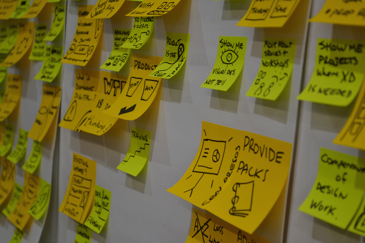
Put all your design work up on a wall where everyone can see it and use it as a blueprint to build from. This becomes your design wall. Rather than creating complex documentation, print everything out and map it out on a wall.
Start with rough hand-drawn sketches or whatever you have. As designs become more polished layer them on top of the initial sketches. As you learn new customer insights or discover usability issues add them with post-it notes. Design walls can take any form or structure that is necessary. Map it out by customer journey, product structure or site map. Whatever makes sense.
The best place for it is right next to your team card wall and backlog where it can help provide clarity for conversations. A good design wall becomes a central point for conversations with the team. It also communicates where you are at to your stakeholders.
Managing stakeholder expectations
This focus on a simple product and lack of locked down details can make a lot of stakeholders nervous in the early stages. The key to overcoming this is to take them along for the journey. Ensure they contribute to the initial vision and see their inputs on the design wall. That gets them excited. A lot of business people are never included in that stage.
Most stakeholders get nervous during the first month or two of a team ramping up. It usually looks like the team is making little progress. The foundational technical work isn’t tangible and screens look rough. The only way to placate those stakeholder nerves is to demonstrate progress.
As a designer you can help by showing the movement on the design wall and seeking stakeholder input. As you work through one feature at a time, the design wall incrementally evolves. Showing how each small step fits in the bigger picture will calm their nerves.
This also allows stakeholders to contribute and influence the process. Seeking their feedback and putting it into action gives people a sense of control over the process.

Be part of the team's workflow
Don’t consider yourself a unique snowflake. Be one with the team. Work within the team’s iterative cycle and workflow.
When trying to fit in to the agile teams, designers often try to create their own separate design process or backlog of tasks. They want to add separate design story cards or do design work that isn’t related to prioritised user story.
Global elements, such as website homepages or navigation, have a habit of triggering this. Designers see these as a design task that they need to do upfront. Write these as a user story and prioritise them along with everything else.
Here’s an example of how you could write them as a user story:
- Homepage: As a user I want understand what a website is when I arrive at it so that I know what I can do on it.
- Navigation: As a user I want a consistent way to navigate through the site so that I can find the content I am looking for.
These global elements are usually (but not always) considered a must have. But yet, they might not be the best place to start building a new product. Often it makes more sense to leave them until after you’ve built a few features or some content first.
This is a natural instinct as designers try to think about how a page design will play out across other functions. The problem is it means you're trying to separate yourself from the rest of the team. Focus your design work on the stories the team has prioritised. Making those parts work well first, then let the bigger picture build and emerge over time.
Get to know the flow of work through a development team
If you know how it works you can figure out how to become part of it. Every other role in the team is part of an orchestrated flow of work. Business Analysts, Developers, Testers and Product Owners all have a place. Designers are no different.
Agile development teams have a tried and trusted process that focuses on delivering value. Pieces of work (i.e. a user stories) are prioritised from a backlog and pulled in to play. They move into analysis, development, testing and are finally released through to production.
Designers do the bulk of their work in the backlog and analysis phase. This is where wireframes and visual design takes place.
Designers also play a role in the development and testing stages as well. The best time to fine tune the details of a new feature is when a developer is actively working on it on their local machine. Sit down a pair with them to tweak those pesky pixels into place.
It’s also important to check new features once they move in to testing. But be aware, there is a time cost if they have to move back in to development. This is why it’s important to pair with devs as they are doing the work.
The iterative design cycle—research and envision for features
I find I design at two different levels: feature sets or individual stories.
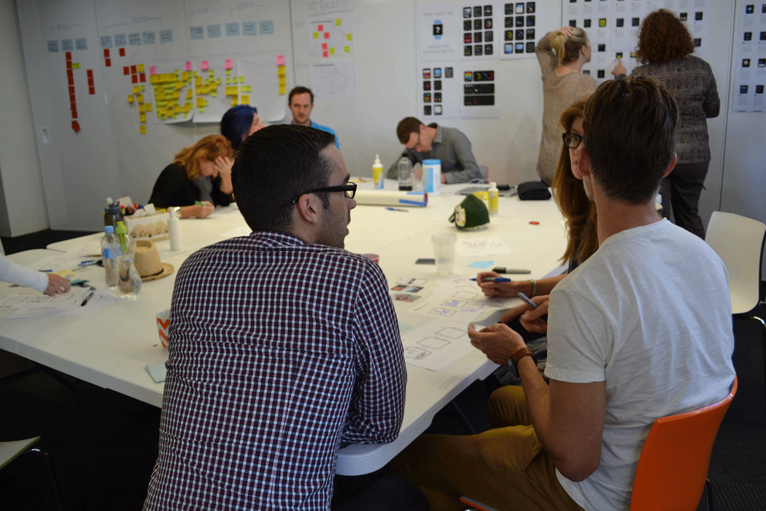
When starting work on a new feature, I start at a high-level by mapping out the user flow and page elements on a whiteboard. This is usually a collaborative conversation with whoever has been driving the product vision. This could be the Business Analyst, Product Owner or Tech Lead.
Share ideas about what this new feature should do and how to build it. Usually the UX Designer and Business Analyst are the ones driving the product vision. By including the Product Owner in this conversation we ensure that it will meet the business needs. By including the Tech Lead we head off any potential technical problems or ideas that just aren’t feasible.
Once we’ve reached an agreement, we can then break it apart in to user stories and discuss what should be in and out of scope for now. The stories in scope can moved into analysis, whilst the out-of-scope stories can be moved to the backlog and left for another time.
This process is typically a 2 week - 2 month cycle. It can cover 1 or multiple iterations.
The iterative design cycle—design for individual stories
Try to design screens for the specific stories and their requirements. Don’t add in elements that aren’t part of the story criteria or are out of scope. Don't try to design the entire experience in one go.
This just confuses the team. It’s hard for devs to work from set of wireframes or visual designs that include every piece of functionality you ever considered. It's confusing to figure out which page components they should or shouldn’t build for their story.
Here’s an example of one of my early failed attempts to work like this. I designed pages that included every feature we ever thought about, regardless of whether they were in or out of scope. As a guide for devs I tagged page elements with the corresponding story numbers on a pink post-it. I thought it was innovative, but it thoroughly confused the devs. In hindsight I should have kept all those extra little design ideas hidden away in a separate file somewhere. Instead I should have output wireframes that only included what was within scope.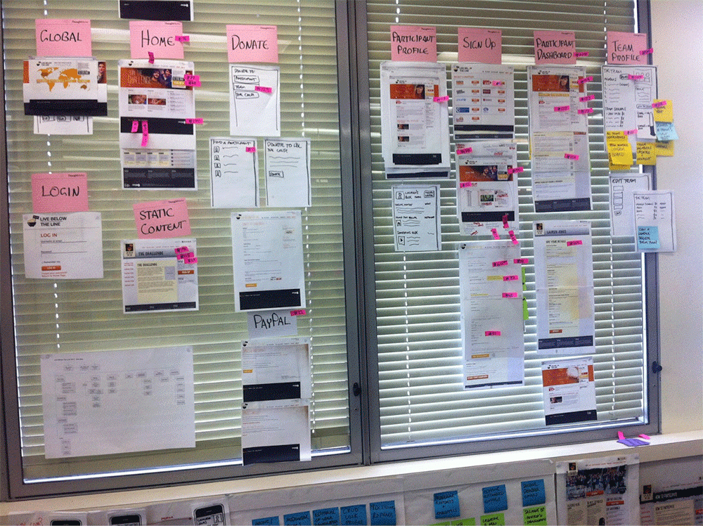
[A good example of how not to communicate your designs to the team.]
Build pages and your designs story by story in the same way the devs will work through it. Remember, you are creating inputs for their coding work (unless you do the coding yourself). Produce assets as the devs get need them. Wait until they are picking up a story and ask them the specs about what they need.
This is where Lean UX and Emergent Design come into the conversation. By only designing for what is going to be built, you are being lean and allowing space for the product details to evolve and emerge over time.
Sometime this cycle leaves you twiddling your thumbs a little. Be patient. Find other ways to add value such as doing some research.
Don't try to make your designs 100% perfect
Be willing to compromise and adjust your designs once you get into code. You can't know every scenario until a dev starts building it. There will always be some hidden gotchas.
Aim for 80-90% complete and allow time for some collaboration in code. Be ready to sit down and pair with devs to answer questions and fine tune the pixel perfect details. Don't get caught up in making everything perfect in Photoshop, that’s not the final medium the product will exist in.
Always prioritise questions from your devs. You want them to reach out and collaborate with you. If they ask for your time, it's an opportunity to have a direct control of the fine details.
Embrace the concept of UX Debt
The term Technical Debt is a way of describing features built in a way that is quicker but comes at a longer-term cost of rework required. Tech debt is usually captured on a story card and added to the backlog of work to be prioritised.
UX Debt is just like Tech Debt. Sometimes you need to compromise on the ideal solution to get something built. Sometimes the perfect design is much harder to build than a slightly compromised version.
Rather than becoming upset about it, capture these compromises as UX Debt and add them to the backlog. Quantify it if necessary. Be respectful if devs raise challenges and issues with your designs. They're not trying to be difficult, they’re just trying to manage their own work and figure out how to build stuff.
Be patient about seeing these sparkles added to the product. Often products will be built in a way that starts with a bare bones structure, covering core functions first. Other more exciting details are then layered in later. This can produce anxiety in designers as their pet features don't come until later. To be fair, sometimes time runs out and they don't get done at all. But you need the core structure in place first before you can enhance it.
This is all a question of scope management and prioritisation. Choosing to build a new feature or spending time polishing an existing one is a valid choice for a Product Owner to make. Both add value to the customer experience, just in different ways.
Where does research fit into this process?
Research should be a continuous activity. You should aim to bring customer insights or feedback into the team on a regular basis, when it can be more directly acted upon.
I usually research at the the feature or story level, just as I design. Researching customer needs at a feature level helps test your ideas and understand what should be in or out of scope. Whilst testing story level designs identifies usability issues.
On a practical level, both of these can be done at the same time. A lot of people advocate for testing whatever you have with a couple of users every week. In these sessions you can both test designs or talk about their customer needs. Sometimes it is necessary to go into more depth for a particular areas of customer needs or behaviours. In this case it might be worth doing a more formal set of sessions with users.
There is no right or wrong with this. The key is understanding what you need to learn about and structuring your research accordingly. Here’s a simple framework to work from:
- Need to learn about customer behaviours and needs? Conduct in-depth interviews
- Are you validating ideas? Test using lo-fi prototypes
- Are you testing page designs? Run task based usability testing
Being the odd one out
Agile development teams usually have somewhere between 4-8 devs and one UX Designer. This is where it can be hard for designers as they feel like the odd one out. Unfortunately only large projects tend to need two or more designers in a team. Just remember, the benefits of working with people who can build your ideas outweigh those of sitting next to other designers.
Most designers are used to working surrounded by other creative folks, not techies. Whilst you do miss that, there are other ways to collaborate with like minded designers. Reach out to designers in other teams and buddy with them. Attend or organise community meetups. There are lots of ways to connect with people outside of your daily workflow.
Be physically part of the team
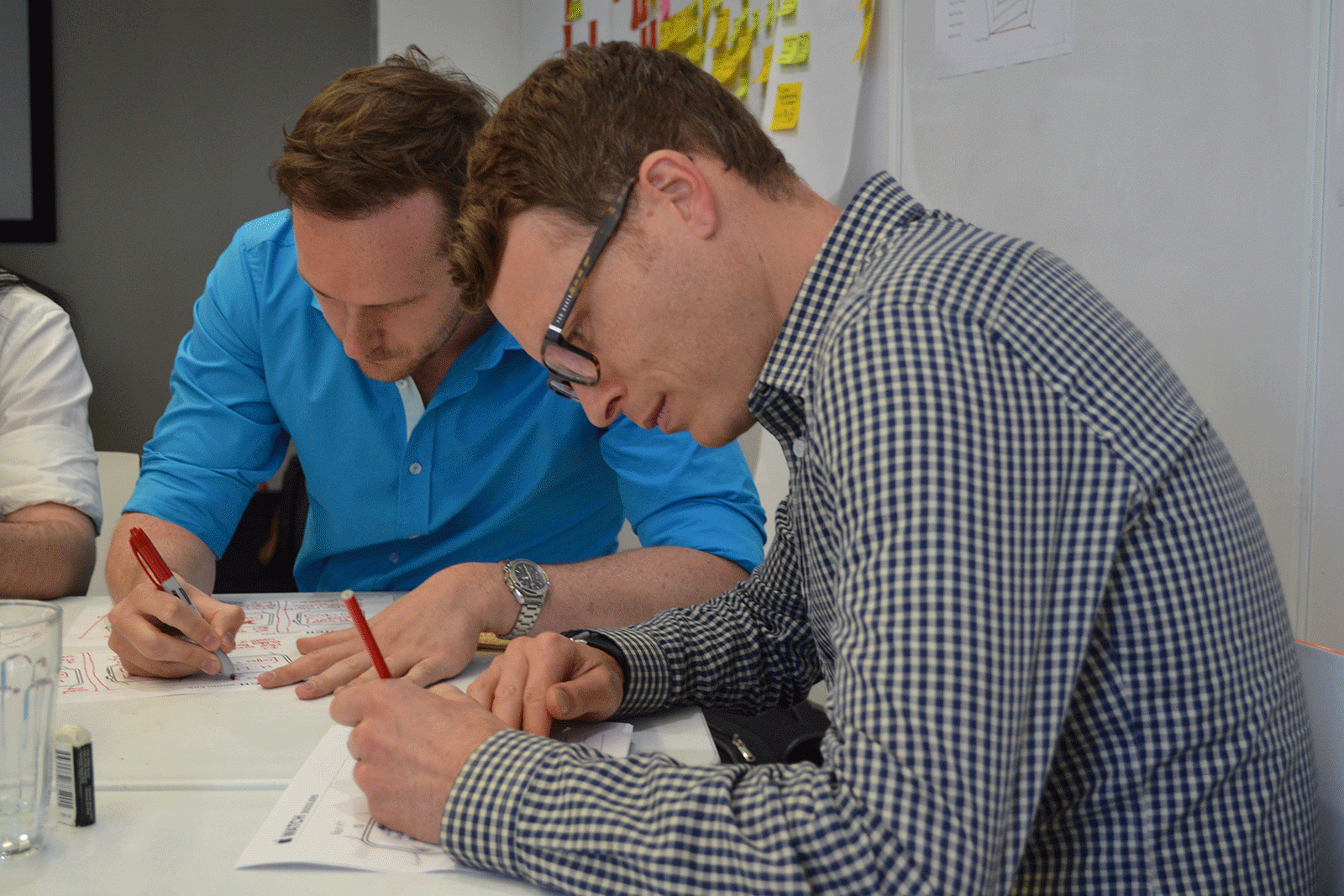
If you want to be part of a team, sit with the team. Right in the middle. Co-location is a key agile principle. Don't let yourself be physically isolated by sitting around a corner or at a different desk. Sit right next to everyone else and be part of the team conversations. It's a symbolic thing.
Never put on headphones. Again it's a symbolic thing. It's a cliche that gets a knee-jerk response from developers. If you want to listen to music, do it as a team. When you need that uninterrupted time to tackle a design problem move to a different space. Go hide in a room for a while. Communicate that is what you are doing and why you are doing it. Be deliberate about it and, as above, don't do it by default.
What advice do you have for UX designers joining an agile development team? What do you wish you knew when you first started out?
Disclaimer: The statements and opinions expressed in this article are those of the author(s) and do not necessarily reflect the positions of Thoughtworks.


