What is the data awesome framework?
In the second part of this three-part series we’ll explore the data awesome framework in more detail, what it is, how to use it and who should use it. (You can find Part One here and Part Three here)
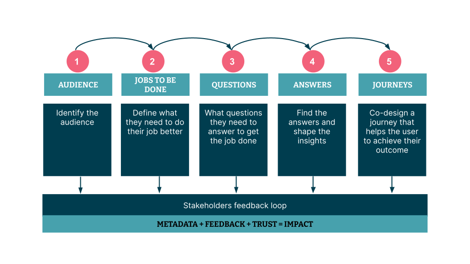
The data awesome framework is made of six modules. The first five are research oriented (typically can be done as a post-it exercise). Everything then comes together in the sixth module where it becomes a powerful narrative that can then be embedded into a dashboard. The framework empowers everyone working with data, from business stakeholders to technologists (data analyst, business analysts, data engineers, experience designer, data strategists), to collaborate effectively to the creation of data products that deliver more value than just making data accessible; they empower people and become essential to run the business. It is a step-by-step repeatable process to drive the creation of enterprise data products that are usable, useful and valuable.
While everything that gets discovered as a part of research in each module becomes part of the insights and dashboard, the data awesome framework is a lot more than just the post-it or research exercise. It is about a guided way to understand the customers and their needs from the data. In the traditional customer search techniques, all the knowledge gets lost and buried into decks and context is lost. With the data awesome framework, it progressively builds in the form of an impactful dashboard.


1. Understand the audience and learn how to speak their language
It should all start with one simple question: whose life are you trying to make better with this data? People usually need specific answers to specific questions in a specific context: don’t fall into the trap of designing for everyone. Instead, group your users based on jobs to be done and on data fluency. Keep it narrowed and focus.
2. Detail what they need to do to get the job done and why
Once you have identified whose life you are trying to make better, we need to figure out how. What are these people trying to do? What situations are triggering the need for the data? Capturing the ‘when’ is a critical step that helps the team to design information in a way that perfectly fits into the user’s workflow. When this happens successfully, adoption from the user side is a no brainer. Finally, we need to capture the why. What is the business outcome of the job to be done?
3. List what questions they need to answer to get the job done and who is actually asking them
What questions do they need to answer to get their job done? This simple exercise can be done in person as a post-it notes exercise or remotely in a digital workspace for virtual collaboration. By answering these simple questions the engineering team starts to shift their mindset from pipelines and dataset to understand and deliver value to users. We recommend to go through this exercise with stakeholders or to play back the team understanding of users needs using the data awesome framework post-its exercise.
4. Find the answers and shape the right insights for the right people
Once we have a shared understanding of what our stakeholders need to know and when, we can check if we have the answers to their questions. If we do, we can shape the insights. Insights are the minimum unit of value. They are made up of questions, an answer, and metadata as the business always wants to know two things: an answer to a question and where the answer comes from (context), and how confident we are in the answer.
5. Co-design a journey that helps users to their job better and achieve business outcomes
Rarely one insight is enough to empower the user to make a decision, take action or tell a story. Insights must be combined in a curated point of view. The point of view must be the point of view of the user. The narrative is the sequence the insights are arranged in that must lead the user to easily find and digest the information she is looking for. Depending on the audience, the narrative will help executives to have a bird eye view of the health of their business by monitoring the key metrics and for operations will support them to report but also to monitor business health, investigate problems and mitigate them.
6. Metadata + feedback + trust = Impact
Becoming a data-enabled organization is a journey, as we mentioned before there are as many challenges on the people side as there are on the tech side. To develop trust and confidence in the data, the framework leverages context alongside the data, by using the metadata about the data. By sharing directly on the dashboard its purpose, as a contract between the engineering team and the business users, it encourages continuous feedback from the users that leads to continuous improvement.
What's next?
In part three we’ll take a deep dive into practical advice for applying the data awesome framework based on our experiences. We will share the top five tips we have learnt by teaching the framework to dozens of teams and business stakeholders.
Disclaimer: The statements and opinions expressed in this article are those of the author(s) and do not necessarily reflect the positions of Thoughtworks.


