Solving the Visual Testing Problem
Let me tell you about my first job at Thoughtworks - and why all was not well.
I was asked to fill the gap in front-end development on an existing team of strong self-identified back-end developers. It turned out that the team was happy to pick up new practices for developing HTML, JavaScript and CSS while delivering the company's new online shop. However, over time it became apparent that much of the finishing touches landed on my desk and undeniably I started assuming a dedicated front-end role.
My colleagues were happy testers much to the delight of our more and more relaxed quality assistant. Back-end services would be tested with unit tests, integration tests, acceptance tests, contract tests, and so forth. While the quality of our back-end improved over time, failures from a broken user interface were showing up at a regular pace. And with the backend testing improving the percentage of UI failures in the overall diminishing failure rate was growing.
And much to my dismay those issues kept coming back to my desk.
Imagine the pain slowly increasing as everything seems to improve and work well except the parts you are looking after. And - it goes without saying - the slightest problem with a feature’s layout will keep the product owner from wanting to release it. Will you have a rock solid back-end just to fall short on the proper alignment of the login button?
I wanted a shiny testing solution for myself and the UI I was helping look after.
This was nearly two years ago. A lot has changed in the meantime.
I now contribute to and maintain a UI testing solution: http://cburgmer.github.io/csscritic. I have a vision: if visual testing becomes easy to do, we will all naturally include it into our daily development cycle. This will then naturally convince developers to test their UI does what it was intended to do. Also, I am not alone. Others have joined in and have their own take on the problem. Now many different tools offer a great selection of choices http://csste.st/tools/.
What happened in between?
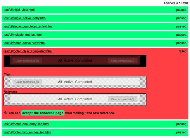
When I realized I didn’t have the tooling I needed to guarantee constant quality I started toying around with different ideas to close this gap. The main difficulty is that common testing patterns cannot easily be applied to a declarative language like CSS. A different approach made sense. Out came a proof-of-concept with a simple idea: holding an up-to-date rendering of the application under test against a snapshot taken in the past to see if something has changed. Just like a “spot the difference” game.
After building up a working prototype I demoed the tool to my colleagues. Everybody was quick to share ideas and point to their own valuable experiences. Erik Doernenburg, Head of Technology for Thoughtworks Europe, then brought me in contact with a general offer we have in Thoughtworks for investing in new ideas called Innovation Week. Through this program, I was given a full week outside the regular project business to work on taking the next step: proving that my testing prototype could be integrated into the workflow of a full development team. One week of busy fiddling showed a mixed outcome. The direction I was moving forward was technically viable but proved more difficult than I initially anticipated. So I was definitely looking at more work to do.

The next project I went on was pretty UI centric. A big part of the team’s work went into making the application beautiful and fun to use. A welcome environment for trying the evolving UI testing tool. I introduced my new team to the idea of UI testing and promptly got encouraging feedback.
When we were doing pair programming my pair watched me writing tests and quickly got to write his first. What he especially liked about the idea of writing UI tests while in the development cycle was that instead of driving out the CSS and HTML structure on a fired-up web application - naturally difficult and time consuming - the test case would provide a small but complete sandbox to quickly build the UI on.
Over the weeks I got more and more confident that failures were found early through the test step. The growing test suite was backing the product’s rapidly increasing UI. In the end we delivered a beautiful application with no visual errors to be found.
One thing I am learning on the way is that testing your front-end forces you to think about components. If you don’t separate your concerns into independent pieces, you will find the application difficult to test. To see that this mantra traditionally coined for unit testing in imperative programming equally applies when developing the UI feels like things are falling into place.
Tests drive out a cleaner design. Refactorings that developers have tried to avoid in the past are becoming safe and efficient with feedback provided instantly. Moreover, testing the visual bits automatically takes workload off quality assurance as manual checks are becoming a thing of the past. Some teams already integrate a tightly knit visual test step in their continuous delivery pipeline with deployments needing less and less manual crosschecks.
So here I am continuing the journey and continuing to convince others to think about UI testing. I believe that visual regression testing completes an overall testing approach. And now is the time to start putting such a tool into the build pipeline.
Are you testing your UI? Not yet? Have a look at one of the example applications and get started.
Disclaimer: The statements and opinions expressed in this article are those of the author(s) and do not necessarily reflect the positions of Thoughtworks.


