The Importance of Invisible Design
While User Experience is generally regarded and defined for the web, it really appears all around us. Driving to work is an experience, as is boiling a kettle, even sitting on a chair is an experience. Whoever is having the experience is the user.
Affordances and Signifiers
Don Norman talks about a common UX principle in his book, The Design of Everyday Things, affordances and signifiers. Affordances are the actions possible by a specific object, and a signifier is an indicator or clue that the affordance exists.

[This wooden box affords the user to open it because of the way it was designed.]

[By adding the button it now signifies to the user that they are able to open it whereas before it could have easily been missed.]
A case study that demonstrates affordances and signifiers is found offline, in New York City in the 1980’s. They overcame their increasingly high crime-rate using the The Broken Window Theory developed by James Q. Wilson and George L. Kelling. The theory is closely tied to the principle of affordances and signifiers. It states that maintaining and monitoring urban environments to prevent small crimes can create an atmosphere of order and lawfulness which may stop further vandalism and escalation into more serious crime.
This worked particularly well on subway cars in NYC. A subway car afforded people to graffiti it, as the surface was flat and the graffiti would be visible to whoever caught the subway. In turn, having graffiti on the subway car signified to other people that the subway car was an affordance for graffiti, indicating to those inclined to graffiti more subway cars. By following the Broken Window Theory and taking a no-tolerance approach to vandalism (if the subway cars were graffitied every single night, the city would clean them every single morning), crime was dramatically reduced and the big city that was crime ridden became a safer place to live.
Affordances and signifiers have become increasingly important to guide the user experience for not only our offline lives but our online lives as well, yet we see these principles skipped often.
Too often we find ourselves getting seduced by new and interesting design patterns or ways to display content that we forget this can come at a price in terms of usability for certain users. As designers and developers we can use affordances and signifiers to aide a fluid user experience for our audience across the website, app or product we are building.
If you are building something for an elderly audience it’s best to explicitly communicate the possibility of an intended action. Some great examples of this are the iPhone slide to unlock animation. Not only does the animation follow the direction in which the user should slide but it also explicitly tells the user “slide to unlock”. This leaves little room for failure which in turn provides a better experience for all types of users.

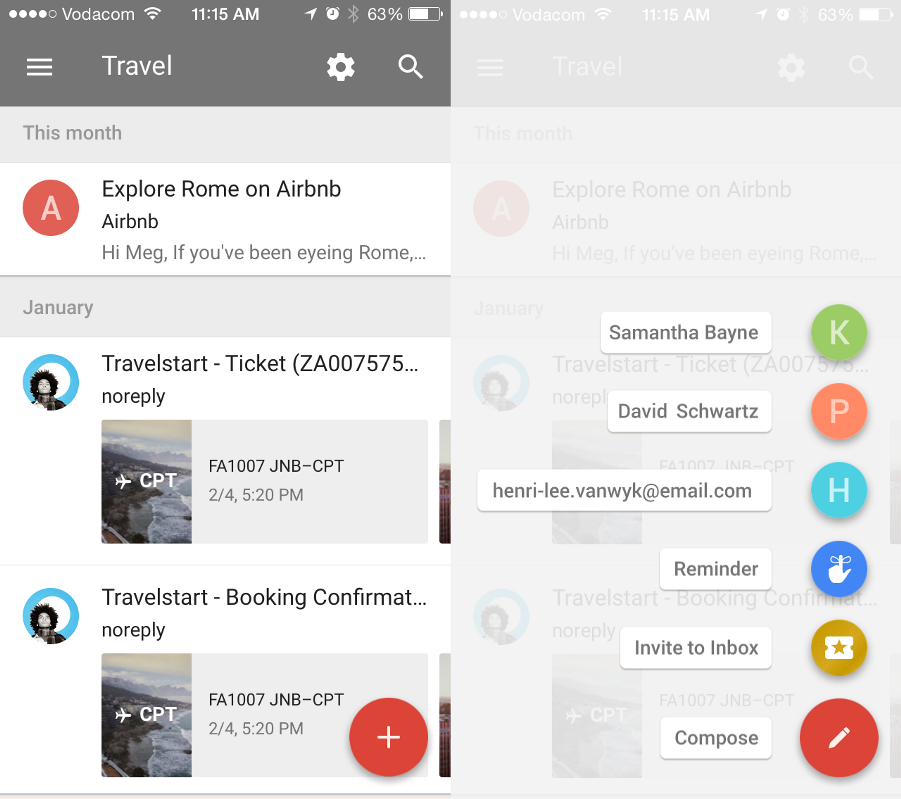
If your users are more tech-savvy, then you could have more room for experimenting with your design. Google’s Material Design introduces a button called the Floating Action Button which plays around with the level of visibility of certain elements.
This button is used by multiple applications in different ways. If the user is using an app for the first time that makes use of this design pattern, it can be quite unclear what this button will do, however that becomes less important than the user knowing that this button will produce a hidden menu. Most users will quickly start exploring the screen when they download an app, clicking on everything to see what they can find and do. When they click on the Floating Action Button, they will quickly discover what lies beneath the button, thus becoming a learned behavior. This saves space on the screen as no labels or explicit affordances are required until the user requests them.

[Google Inbox uses the Floating Action Button to reveal your favorite contacts, reminders, a invite button as well as turning the actual button into a Compose button.]
Signifiers and affordances can be a designer’s greatest weapon. When we understand who we are designing for, we are able to either highlight certain elements more clearly or experiment with our design. Our designs should always be interesting and delightful but more importantly — useful and clear to our users. As soon as we are able to achieve this balance all the tasks in our designs that need to be completed are done so in such a simple sensical manner that the design becomes not only intuitive — but invisible.
Disclaimer: The statements and opinions expressed in this article are those of the author(s) and do not necessarily reflect the positions of Thoughtworks.


